
zendo:

from overwhelm

to focus

My Role
  • UI Design
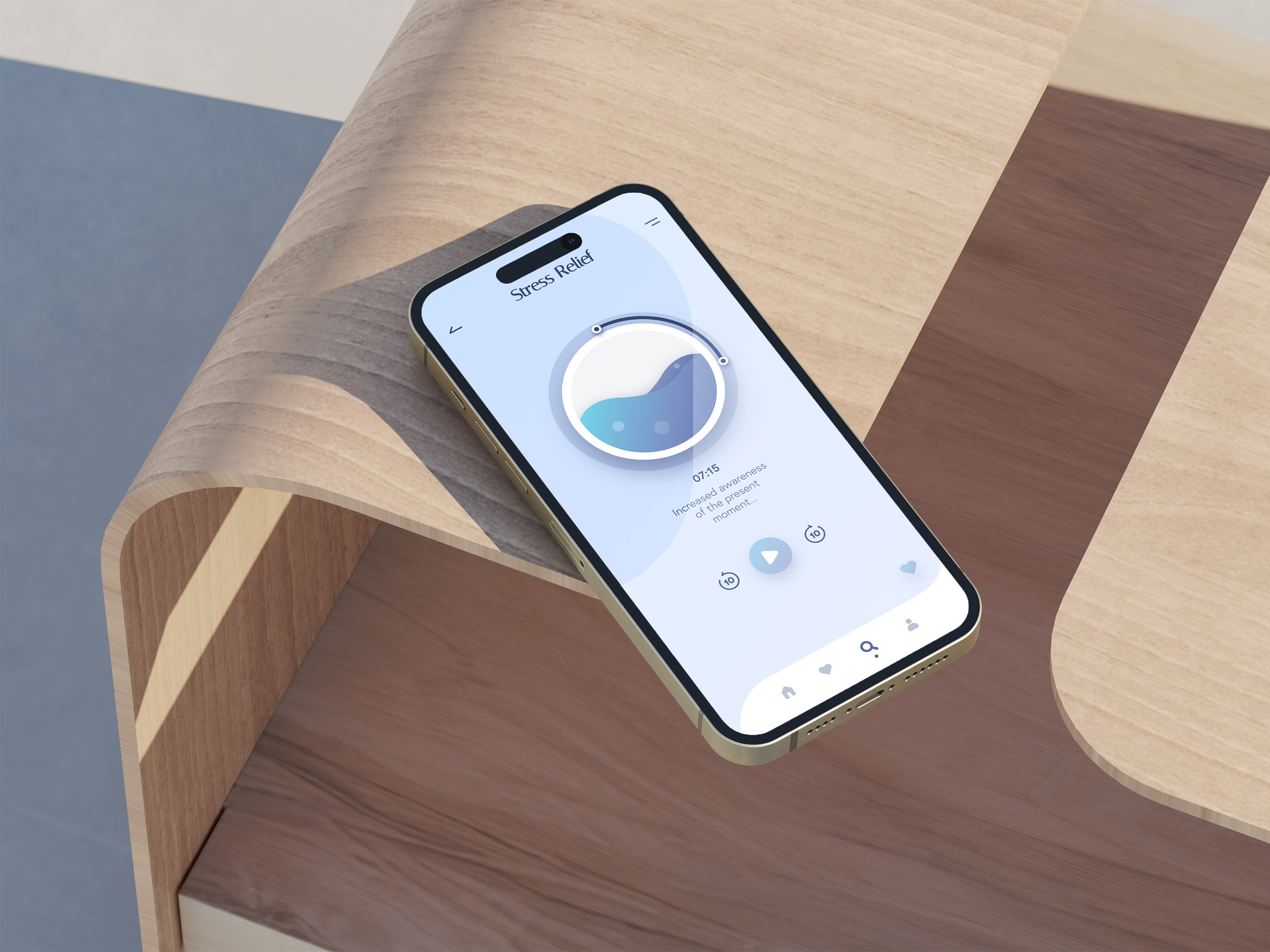
    Translated mid-fidelity wireframes provided by the UX team into high-fidelity interfaces, with a focus on clarity, intuitive flows, and a calm visual experience.
  • Style Guide Development
    Created a cohesive visual system covering typography, color, and iconography to ensure consistency across the app
  • Motion Design
    ‍
    Designed UI animations and transitions to support navigation, provide feedback, and create a calm, continuous experience. Extended the visual language into an animated app promo, using motion, typography, and screen choreography to communicate the product concept and showcase the experience.
    ‍
Tools Used
⁕    Adobe XD
⁕    Adobe Photoshop
⁕    Adobe Illustrator
⁕    After Effects
Project Overview

Zendo is a conceptual meditation app designed to help people establish a consistent mindfulness routine without feeling overwhelmed.

The interface was designed around one central objective: making it easier to begin and maintain a meditation habit. Visual hierarchy, interaction feedback, and motion were therefore treated as functional parts of the experience rather than decorative additions.

The Challenge
Meditation apps are intended to create calm, yet dense content, complex navigation, and unclear entry points can make them feel demanding, particularly for new users.
‍
The UI challenge was to make the experience feel focused and approachable while keeping essential functions visible and easy to understand.
Assumptions
⁕ Clear, distraction-free interfaces can make it easier to begin a new habit.

⁕ Strong visual hierarchy can guide attention and reduce unnecessary decisions.

⁕ Subtle motion can communicate feedback and orientation without disrupting focus.

As this was a student project, these assumptions were informed by established UX patterns and interface analysis rather than direct user research.
Approach
Because the core flows had already been defined by the UX team, I concentrated on how clearly and consistently the experience was communicated. My work focused on three areas:
‍
⁕  A calm and consistent visual system
⁕  Clear hierarchy and readable layouts
⁕  Motion that supports interaction without competing for attention

design prOcess

01

Understanding
UX Foundations

I reviewed the provided wireframes and user flows to understand the intended structure, user goals, and key interaction points. This gave each visual decision a clear relationship to the underlying experience.

02

Translating Wireframes into High-Fidelity UI

I developed the core screens into high-fidelity interfaces, refining hierarchy, spacing, and emphasis so that primary actions were recognizable at a glance.

03

Building a Cohesive Visual System

I created a style guide for typography, color, and iconography. The system balances a soft, calm atmosphere with sufficient contrast, readability, and structural clarity.

04

Designing Motion and Microinteractions

I used a storyboard to define how the interface responds as users move through the app.

⁕ Screen transitions and menu-state changes
⁕ Meditation-card movement and player progress
⁕ Play-to-pause feedback
⁕ A restrained splash-screen logo animation

design challenges & solutions

1. Keeping the interface minimal but discoverable
‍
A minimal interface can conceal important functionality. I compared layout variations and refined hierarchy and placement so core actions remained visible without adding unnecessary elements.

2. Building a Consistent Visual System
‍
The visual language needed to feel soft and approachable without weakening readability. Consistent type, color, iconography, and spacing created coherence while preserving a clear structure.

3. Using motion without creating distraction
‍
Animation was limited to moments where it could clarify state, provide feedback, or support orientation. Timing and movement were kept restrained to match the context of meditation.

4. Working Within Defined UX Constraints
‍
With the principal flows already established, the design work focused on improving how the experience was communicated visually and interactively rather than redefining its functionality.
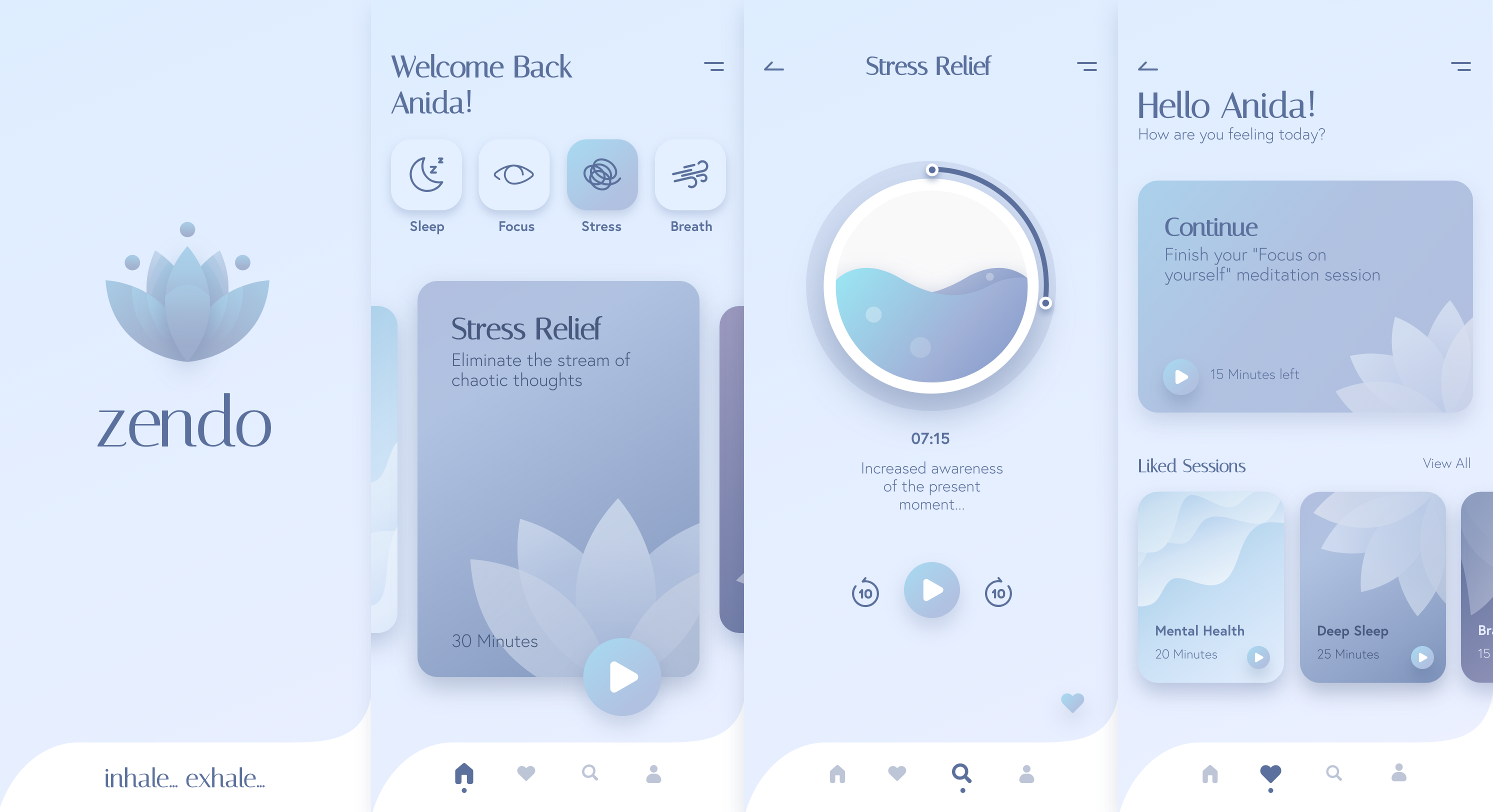
splash screen

home screen

player screen

liked sessions

Outcome & Impact

The final concept presents a cohesive interface built around clear hierarchy, consistent patterns, and restrained motion. Together, these decisions support the intended experience of making meditation feel approachable and easy to integrate into everyday life.*

* Because the project was not released or tested with users, the outcome should be understood as a design proposal rather than evidence of measured behavioral impact.