oasis: simplifying

smart plant care

My Role
  • UI/UX Design
    ‍
    Conducted competitive analysis, defined user flows, and designed high-fidelity interfaces for iOS and Android using familiar platform patterns.
  • Visual & Brand Development
    Created a visual system built around natural tones, clear hierarchy, and accessible presentation of plant-health information.
  • Motion & Illustration
    ‍
    Created animated onboarding illustrations and UI feedback to clarify the experience and reinforce the product’s character. Extended the visual language into animated logo and app promos, using motion to communicate the brand and showcase the product experience.
  • Prototyping & Testing
    ‍
    Built interactive prototypes, conducted usability tests, and refined key screens based on observed navigation and comprehension issues.
Tools Used
⁕    Adobe XD
⁕    Adobe Photoshop
⁕    Adobe Illustrator
⁕    After Effects
Project Overview

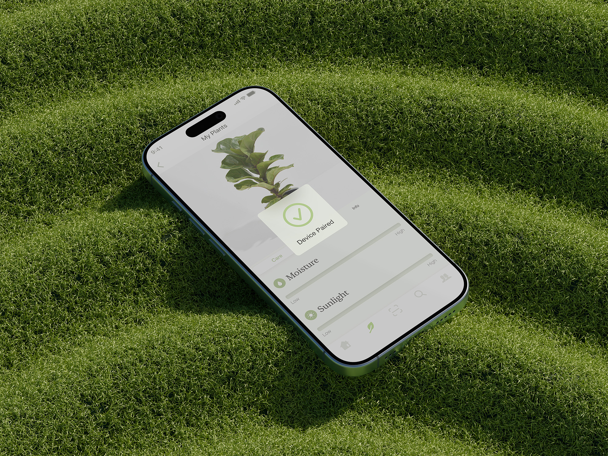
Oasis is a conceptual native iOS and Android app that combines real-time plant data with practical care guidance.

The project explores how moisture, sunlight, and temperature readings can be translated into clear, actionable information for everyday plant owners. The objective was not simply to display data, but to help users understand what their plants need and act with greater confidence.

The Challenge
Plant care often becomes difficult because people are unsure what their plants need or when action is required. Existing apps may provide generic advice, offer limited real-time information, or present data with either too little context or too much complexity.

The challenge was to make sensor-based information precise enough to be useful while keeping it simple enough to understand quickly.
Assumptions
⁕ Users need guidance and context rather than raw measurements alone.
‍
⁕ Real-time information is valuable only when its meaning is immediately clear.
‍
⁕ Hardware-connected features require especially clear setup and feedback.
‍
⁕ Users expect interactions that are familiar within their chosen mobile platform.

‍Within the three-week student-project timeframe, I grounded these assumptions in competitor analysis, established patterns for data-heavy products, and prototype testing.
Approach
I organized the experience around the questions a plant owner is most likely to ask:
‍
⁕   What does my plant need right now?
⁕   Do I need to take action?
⁕   How has its condition changed over time?

This shifted the focus from feature density to prioritization, interpretation, and timely feedback.

design prOcess

01

Competitive Analysis & Gap Identification

I reviewed plant-care apps including Blossom and WatchFlower to compare their data presentation, guidance, setup flows, and platform patterns. The analysis highlighted opportunities to give data more context and simplify the path from information to action.

02

User Flow Definition

I mapped the journey from onboarding and device pairing to plant monitoring, ensuring that each step prepared users for the next and made the value of the system understandable.
‍


‍

03

Wireframing & information Structure

Early sketches explored how moisture, light, and temperature data should be grouped, prioritized, and connected to recommended actions.

‍

04

Platform-Specific UI Design

I translated the structure into high-fidelity iOS and Android interfaces. Native patterns were adapted where necessary while the shared visual language maintained a consistent product identity.


‍

05

Prototyping & Testing (Iteration)

I tested high-fidelity prototypes to understand how participants interpreted the data and moved through the main flows. The findings led me to improve contrast, simplify navigation, and remove visual elements that competed with essential information.


‍

design challenges & solutions

1. Making Complex Data Understandable
‍
Raw measurements were paired with clear status indicators, concise language, and simple charts so users could understand both the current condition and whether action was needed.

2. Maintaining cross-platform consistency
‍
The iOS and Android versions needed to feel related without ignoring platform conventions. I preserved a shared hierarchy and visual language while adapting navigation and controls to familiar native patterns.
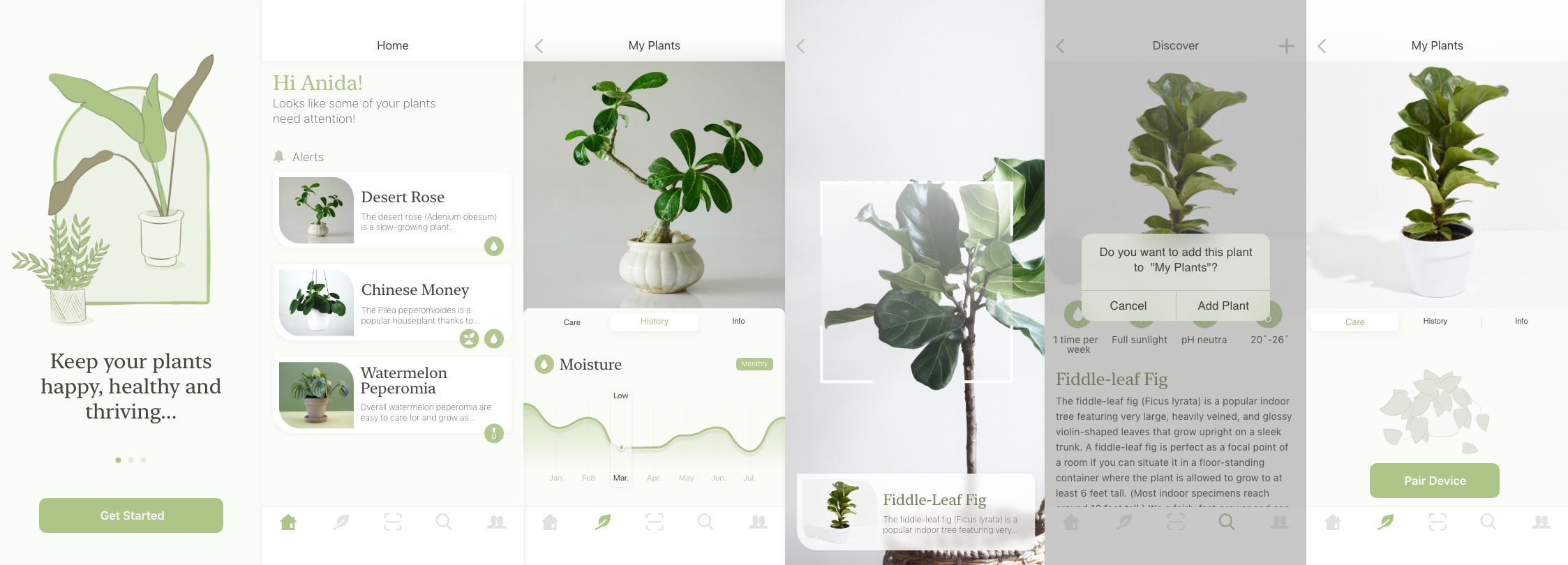
home screen

plant information

plant
scanning

adding new plant

pairing monitoring device

Outcome & Impact
‍

The final concept presents plant-health data through a calm, structured interface. Status indicators, care guidance, and reminders clarify what users should notice and when they may need to act, while onboarding explains how the monitoring system works.*

* The project was not developed or evaluated at scale, so its outcome is a tested design direction rather than evidence of long-term changes in plant-care behavior.