bean&brew:

curating coffee

experiences

My Role
  • UX Strategy & Design
    Defined and refined journeys for product discovery, comparison, selection, and checkout.
  • Visual & Brand Development
    ‍
    Created a cohesive visual system combining warm, natural brand cues with clear hierarchy, accessible interactions, and a consistent product identity.
  • Motion Design
    ‍
    Designed interface feedback and transitions to communicate state and support key shopping interactions. Extended the visual identity through animated logo and product presentations, bringing the brand and app experience to life through motion.
  • Prototyping & Testing
    ‍
    Built wireframes and interactive prototypes, tested navigation, filtering, and cart-management assumptions, and iterated on the main flows.
Tools Used
⁕    Adobe XD
⁕    Adobe Photoshop
⁕    Adobe Illustrator
⁕    After Effects
Project Overview

Bean&Brew is a conceptual e-commerce app for discovering and purchasing organic specialty coffee and premium brewing equipment.

The project addresses a central tension: creating a curated, premium shopping experience without making product discovery and checkout feel slow or complicated.

The store’s focus on organic beans and specialist equipment informed both its product hierarchy and its visual identity.

The Challenge
Coffee-shopping experiences often present large catalogs with limited guidance, while highly styled concepts can make comparison and navigation more difficult.

The challenge was to help users discover suitable products, compare meaningful attributes such as origin, flavor profile, brewing method, and price, and move confidently toward a purchase without losing the sense of curation.

Assumptions
⁕ Specialty-coffee customers benefit from guidance, not only a product catalog.
‍
⁕ Clear labeling, categories, and hierarchy can make comparison easier.
‍
⁕ Browsing, selection, cart management, and checkout should remain recognizable and direct.

These assumptions guided the design and were explored through informal testing of wireframes and interactive prototypes.
Approach
I designed the core shopping interactions first and used the visual identity to reinforce hierarchy, product quality, and trust. Motion and visual detail were applied only where they supported feedback or orientation.

Given the limited project timeframe, I prioritized the flows with the greatest influence on product discovery and purchase decisions rather than developing a broad feature set.

design prOcess

01

Defining Core Interaction Flows

I identified the actions that form the foundation of the shopping experience:

❋   Browse coffee beans by type, origin, or flavor profile
❋   Compare products by taste, brewing method, or price
❋   Find suitable brewing equipment
❋  Review the cart and complete a purchase


02

Designing Within Constraints

To keep decision-heavy screens focused, I simplified layouts, limited competing elements, and used clear touch targets and predictable navigation.

❋   No advanced filters beyond the essential categories
❋   No decorative elements that compete with product information
❋   No hidden navigation or unfamiliar gestures


03

Translating specialty coffee into a usable visual language

Rather than relying on literal coffee imagery alone, I used warm color, considered typography, and consistent spacing to convey curation. Contrast directs attention, motion confirms actions, and visual consistency supports orientation and trust.

04

Iteration & Validation

Prototype testing examined whether users could find and compare products, complete primary actions efficiently, and understand the store’s specialist positioning. The findings informed refinements to hierarchy, layout, filters, and interaction feedback.


‍

design challenges

1. Balancing Usability with Brand Identity
‍
A warm, natural visual identity needed to coexist with clear commerce patterns. I iterated on color, typography, and iconography so the brand remained recognizable without reducing contrast or obscuring interactive elements.

2. Reducing complexity in decision-heavy areas
‍
Product selection and cart management involve several small decisions. Testing led me to strengthen menu visibility, clarify filtering, and refine cart feedback so users could better understand their options and the result of each action.
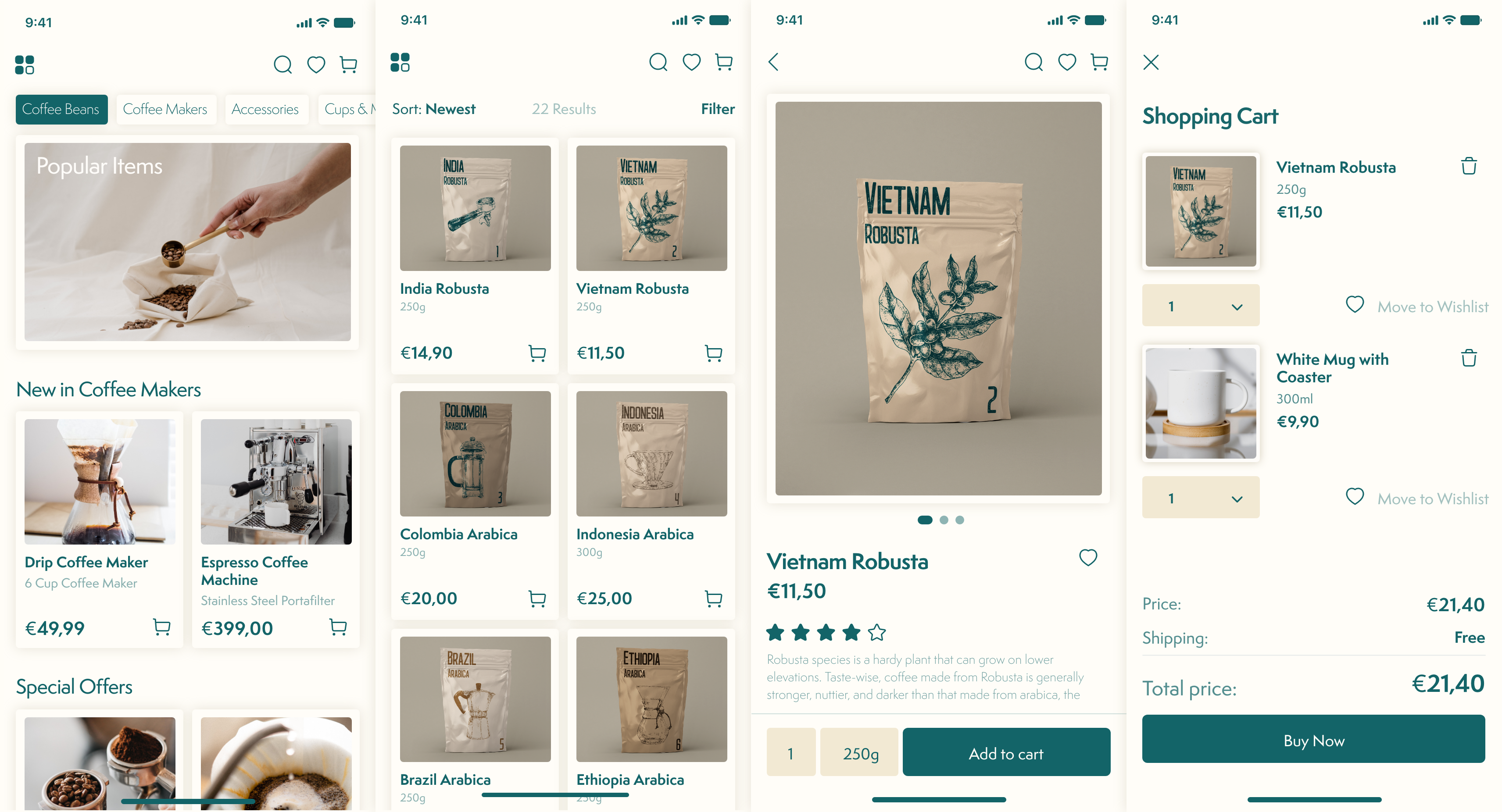
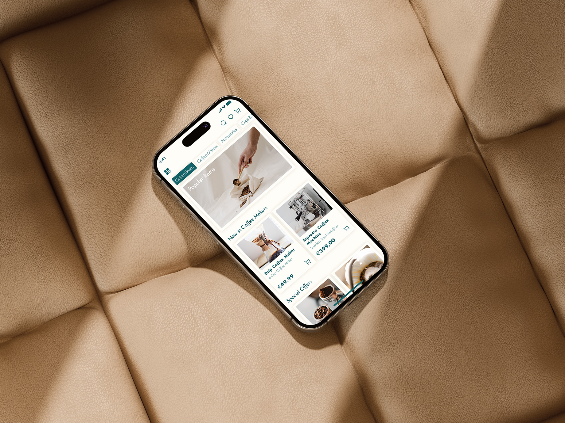
home screen

browsing screen

item detail screen

shopping cart screen

Outcome & Impact

The final concept provides a focused path from product discovery to checkout. Clear categories and product information support comparison, while the visual system communicates the store’s curated, premium positioning.*
‍

* As a conceptual student project, Bean&Brew demonstrates a considered design direction; it does not claim measured improvements in conversion, trust, or purchasing behavior.