Loading

You made it!

100%

80s Music Player App Case Study

Objective

The goal of this project was to design a user-friendly mobile app, "Wave," catering to 80s music lovers aged 35 to 55. The app needed to serve as a comprehensive tool for users to explore their favorite 80s artists, create playlists, and connect with fellow enthusiasts through music sharing.

Role

This project was completed as a part of  my UI course. My role was to perform a competitive analysis, create wireframes, mood board, style guide and to design the final app screens.

Tools

Adobe XD
Adobe Photoshop
Adobe Illustrator

Timeline

2 Weeks

About

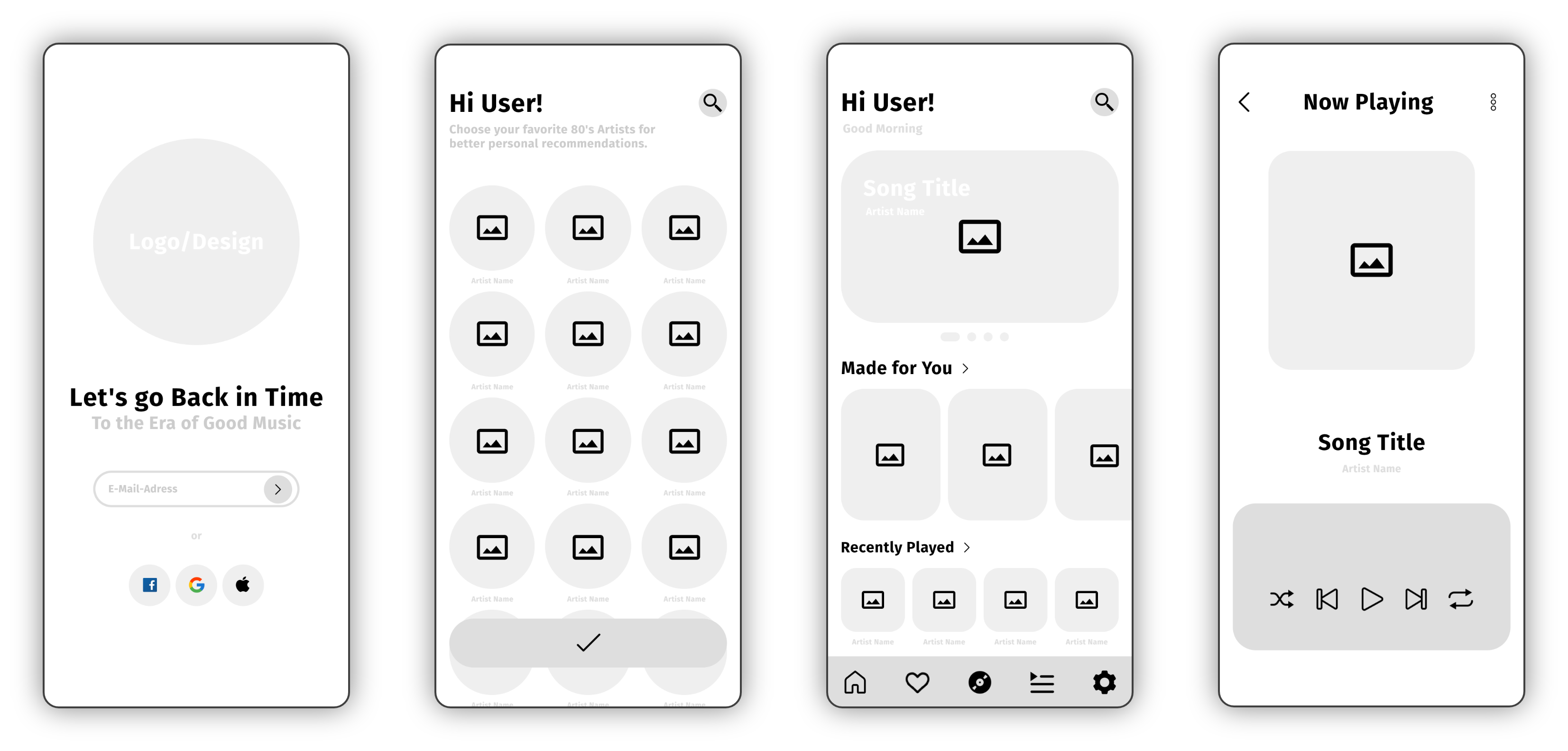
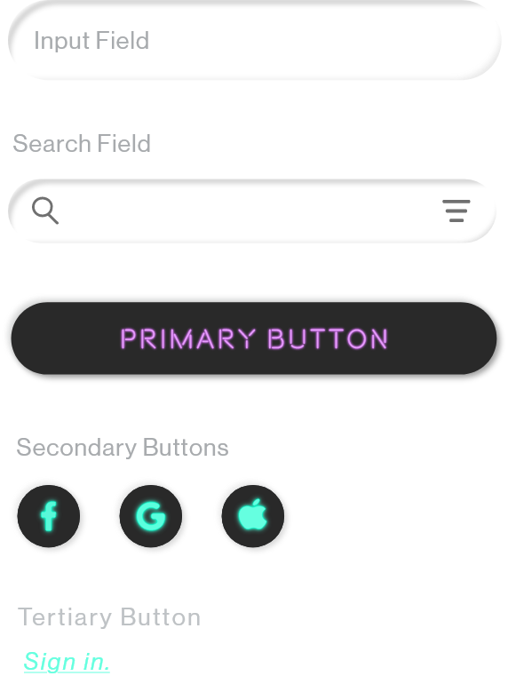
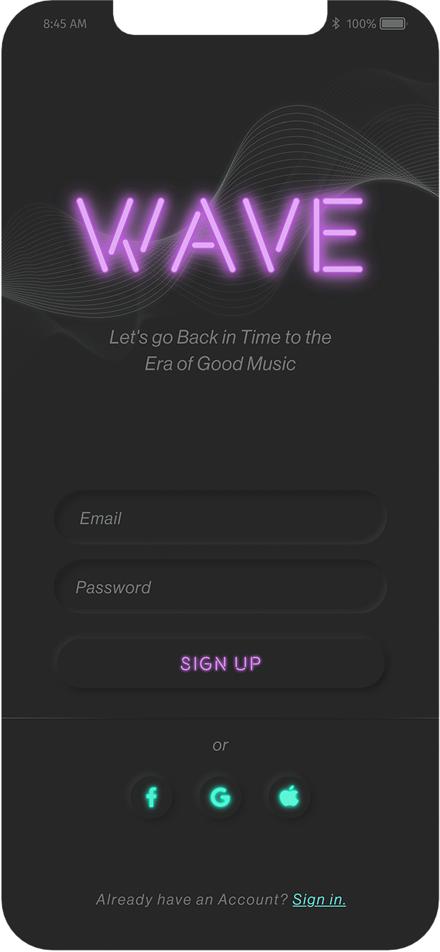
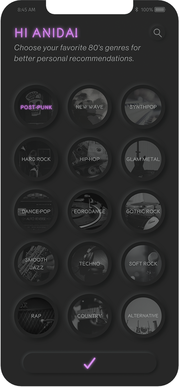
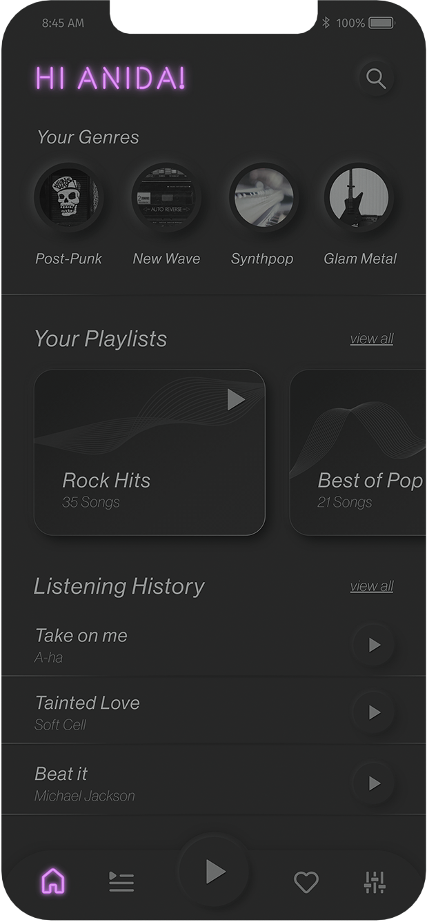
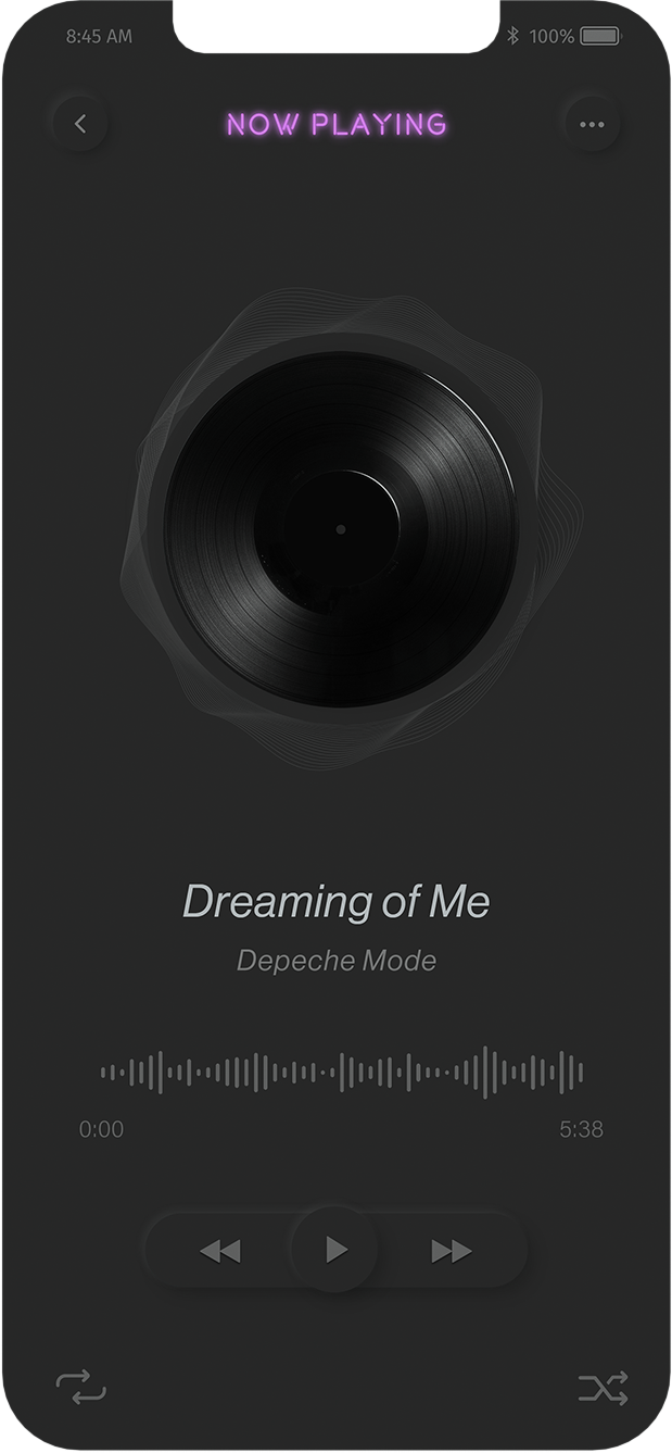
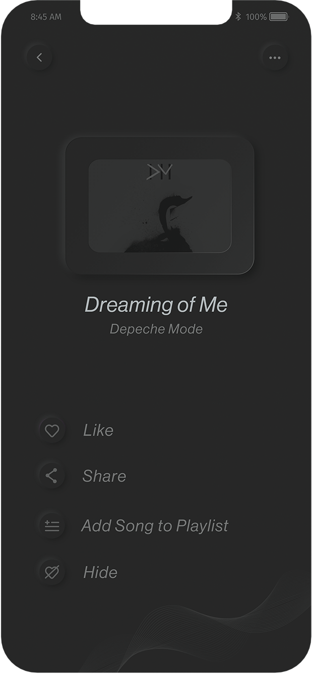
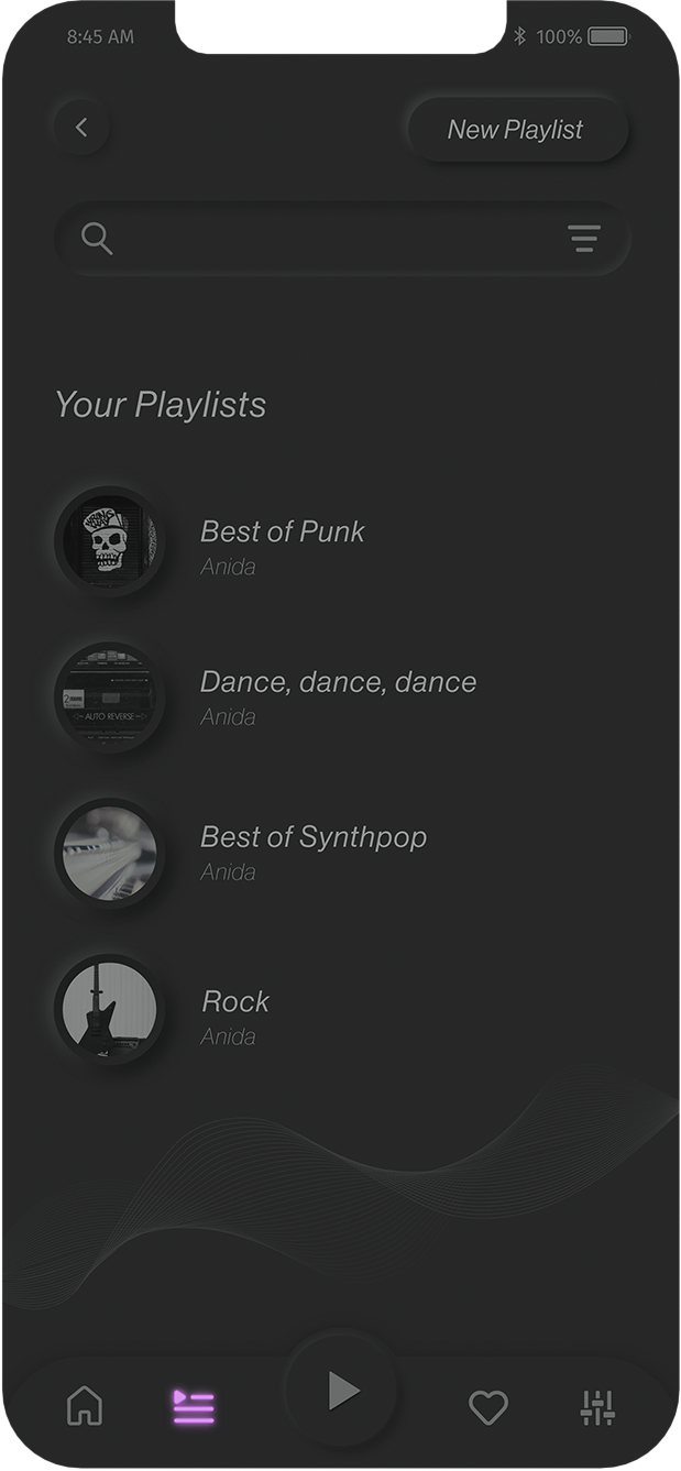
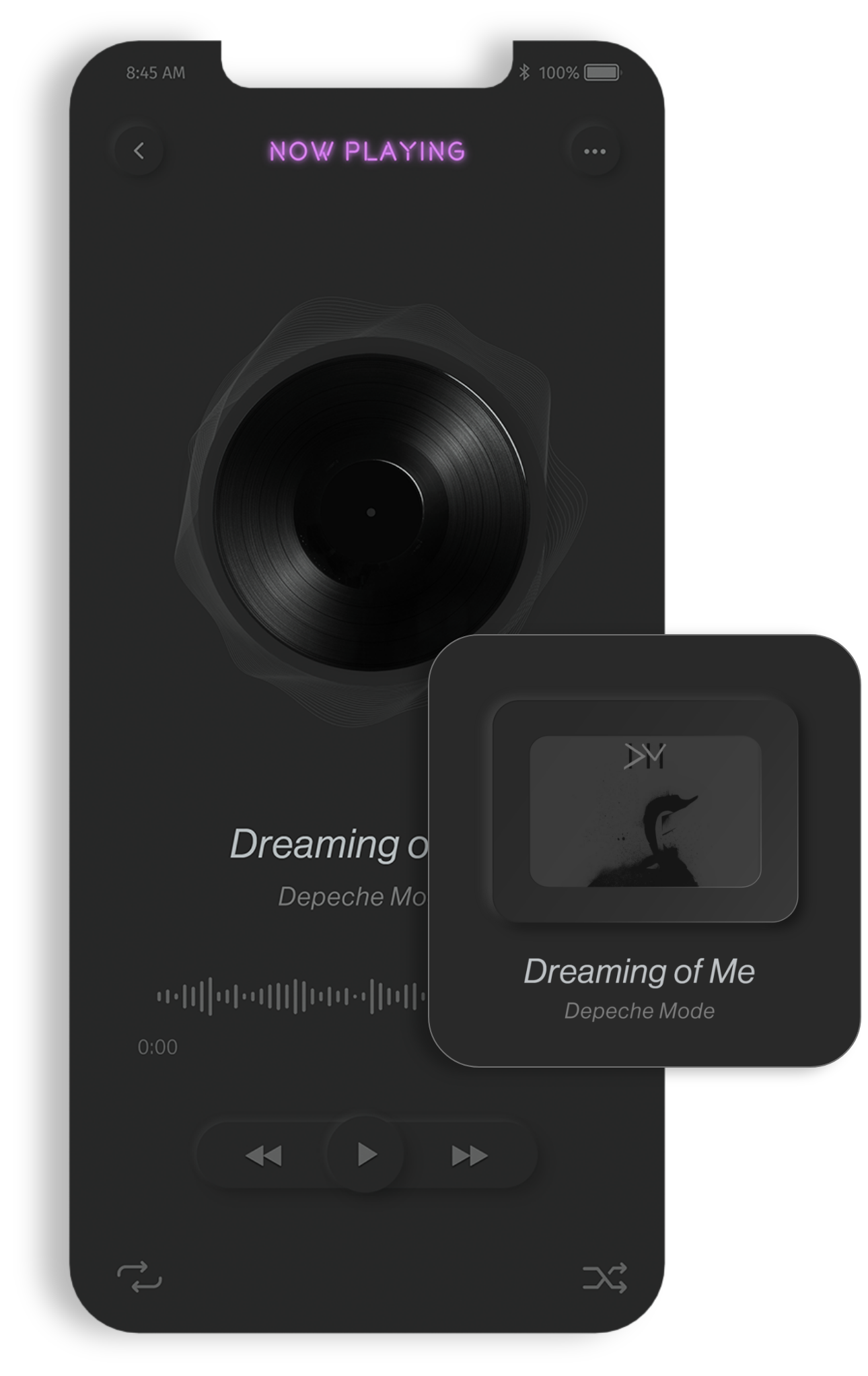
"Wave" is an 80s music player app designed to evoke nostalgia through a minimal, simple, and dark-themed interface. The incorporation of neon accents enhances the overall 80s vibe, creating an immersive experience for users.

Problem

Existing music player apps dedicated to 80s music lacked crucial features, displayed outdated designs, and often failed to meet user expectations. The challenge was to address these shortcomings and design an app that would stand out in the market.

Solution

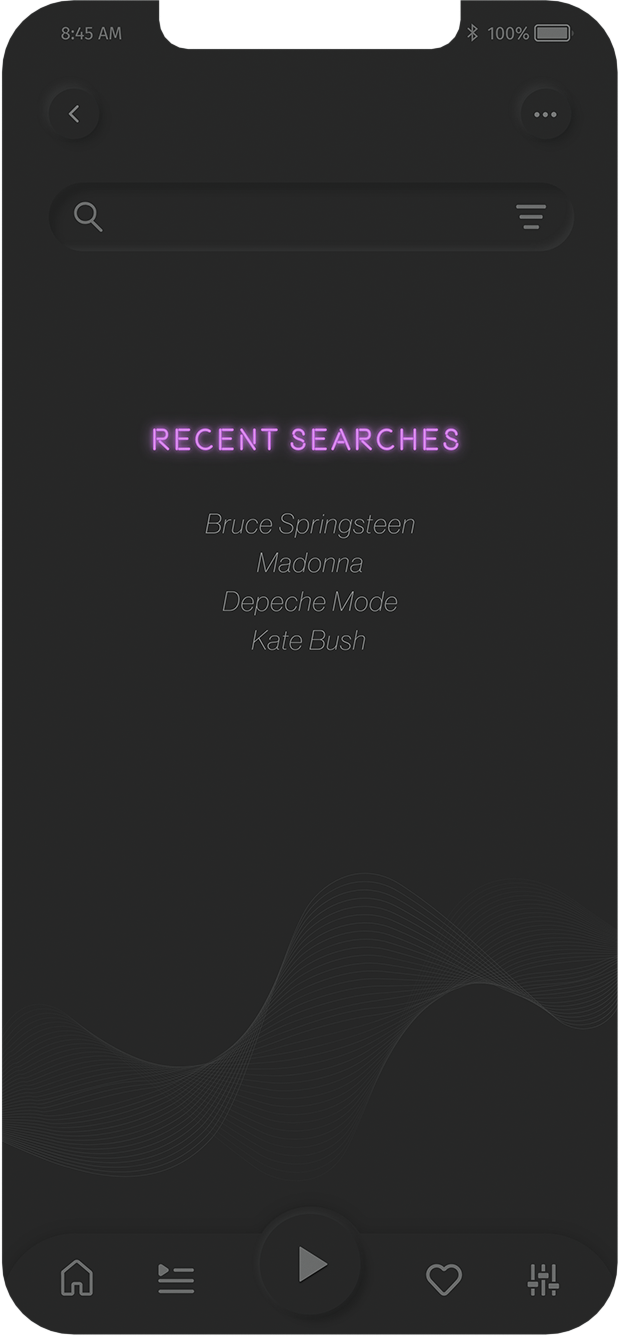
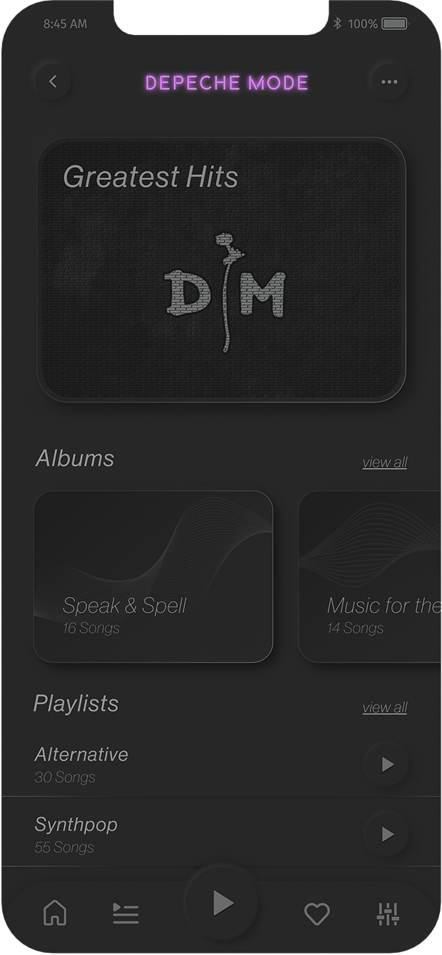
"Wave" addressed these issues by offering users features such as personalized music recommendations, profile creation, playlist management, and social interactions like liking, sharing, and hiding songs. The app's simplicity and adherence to common design patterns ensured a user-friendly experience tailored to the target audience.

Design Process
Competitive Analysis

Thorough research on both direct and indirect competitors laid the foundation for the app's development. Analyzing strengths and weaknesses, identifying valuable features, and recognizing areas for improvement informed my design process.

Wide variety of well organized listening options on the home screen.
Personalized recommendations.
The screens are very crowded with information, which can be overwhelming.
80s music player with variety of 80s hits.
Missing features (Adding songs to playlists, liking songs).
The overall design is outdated.
Wireframes
The analysis of similar apps helped me better understand my competitors and gave me insight into features I wanted to include in my app. I began sketching out user flows and features in order to get a rough idea of what the application could look like.
Transitioning to mid-fidelity wireframes provided a clearer picture of the app's structure and functionality.
Mood board
A mood board was created to visualize the desired vibe for the app. The gray vintage look, combined with neon elements, aimed to recreate the intimate atmosphere of an 80s rock bar.
Style Guide
The mood board guided the creation of a style guide, defining the color palette, typography styles, and UI elements. The chosen typefaces, Neue Haas Grotesk for body text and Beon for titles, struck a balance between 80s nostalgia and readability.
final Design
Applying visual design choices to mid-fidelity wireframes resulted in the creation of the final mobile screens. The cohesive design showcased the retro aesthetics while maintaining user-friendliness.
The primary challenge was achieving a retro look while prioritizing user-friendliness. The typeface selection presented a roadblock, leading to the adoption of a neutral typeface (Neue Haas Grotesk) for most text and a bolder typeface (Beon) for titles, achieving the desired neon sign effect. Adhering to a user-centric approach required continuous reassessment and adjustment of design choices to ensure an excellent user experience."Wave" successfully brings together the best of 80s music nostalgia and modern usability, providing a unique and enjoyable experience for its target audience.
Previous Project Next Project