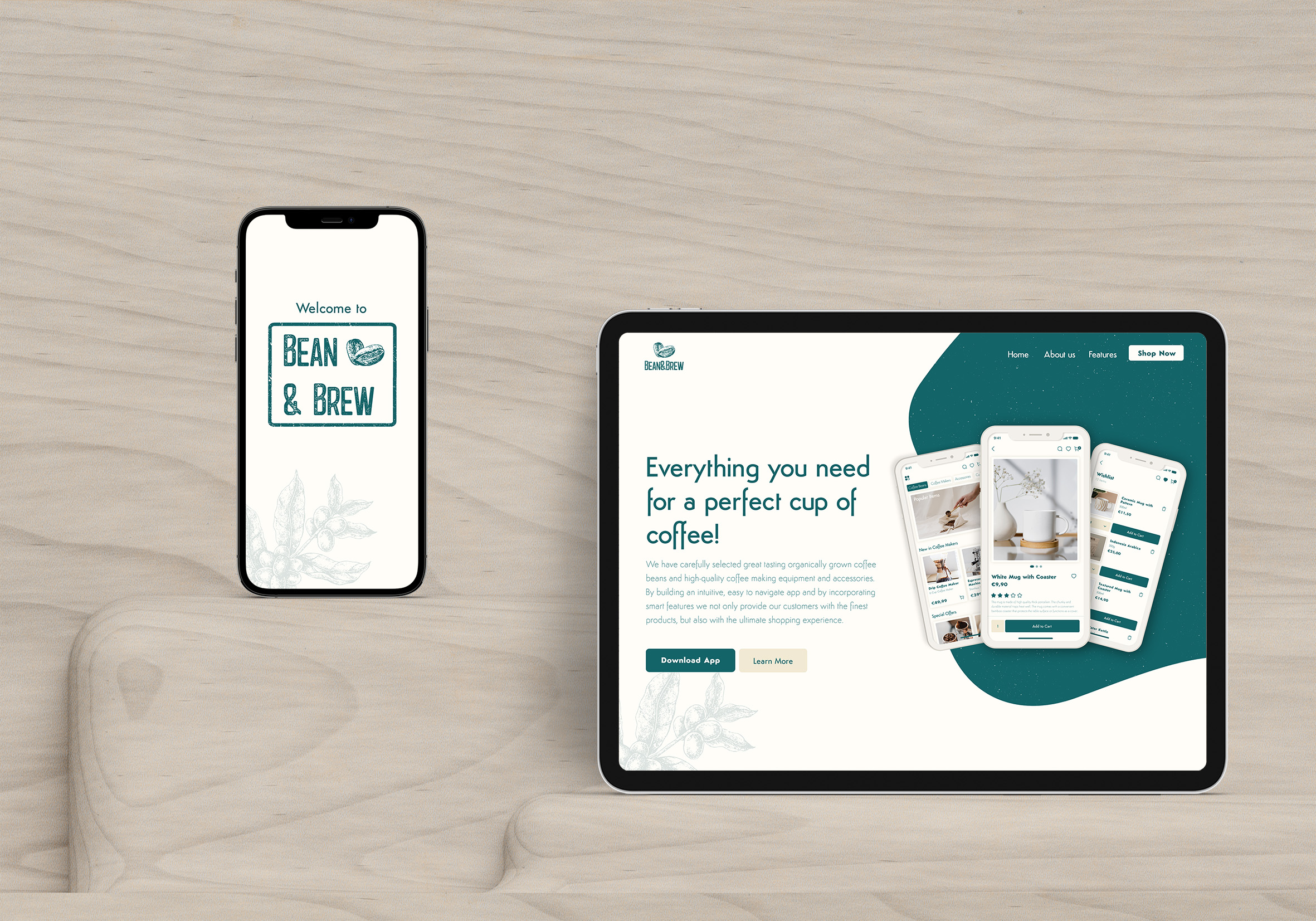
The primary objective of the Bean&Brew project was to create a comprehensive online platform tailored to customers' specific needs, emphasizing a user-friendly interface and a seamless shopping experience for coffee enthusiasts.
UX/UI Designer
Adobe XD
Adobe Photoshop
Adobe Illustrator
3 Weeks
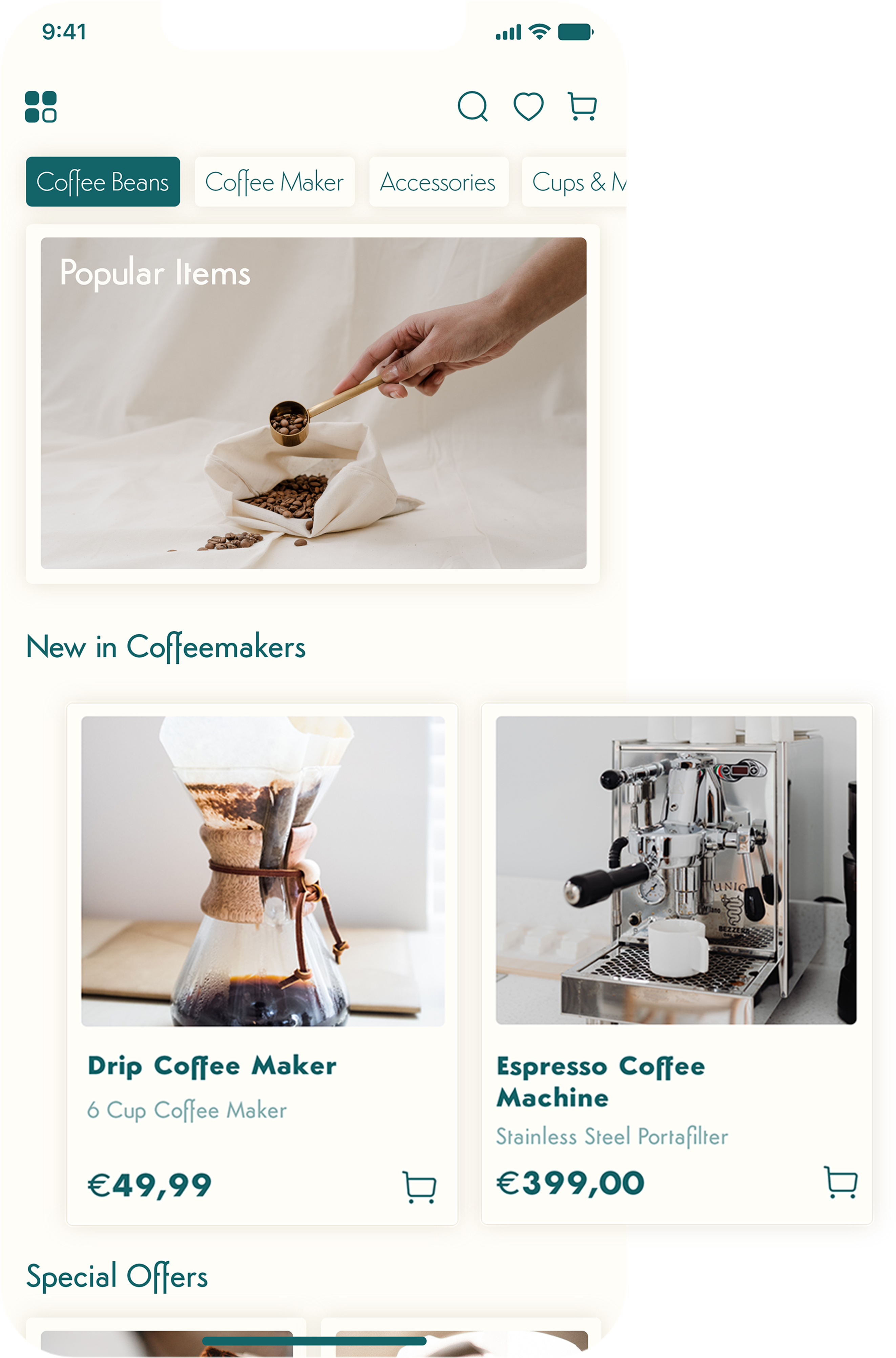
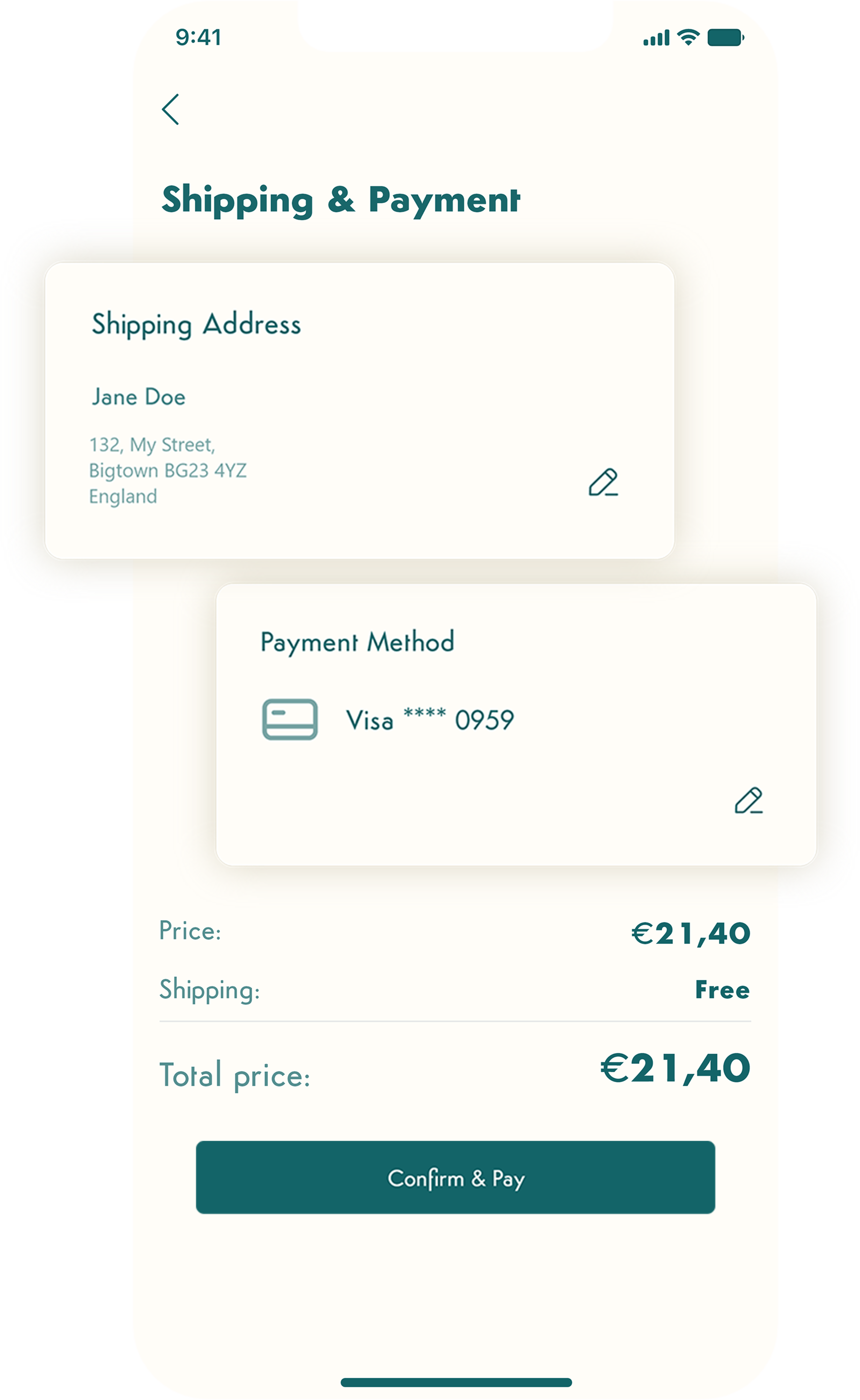
Bean&Brew is an online store offering customers the finest organically grown coffee beans and high-quality coffee making equipment and accessories, all in one place. The intuitive, easy to navigate app with its smart features provides the customers not only with the finest products, but also with the ultimate shopping experience.
With coffee being the most consumed beverage globally, the closure of many coffee shops due to the Covid-19 pandemic led to a surge in home brewing. This shift prompted an increased reliance on online stores for coffee-related products, creating an opportunity for Bean&Brew to address the evolving needs of customers seeking quality coffee experiences.
Recognizing the growing demand for home brewing, the solution was to develop an online store app that offers a diverse range of products essential for crafting a delightful cup of coffee. By consolidating these products in one place, the app streamlines the shopping process, saving customers time and effort. This approach eliminates the need to visit physical stores, providing a convenient and reliable solution for coffee enthusiasts.

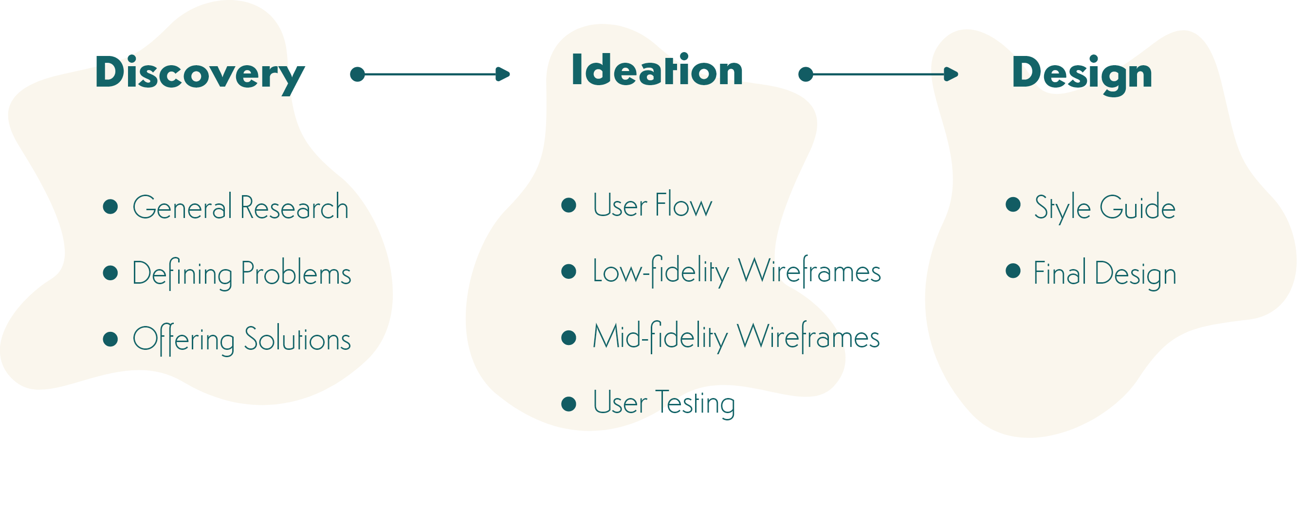

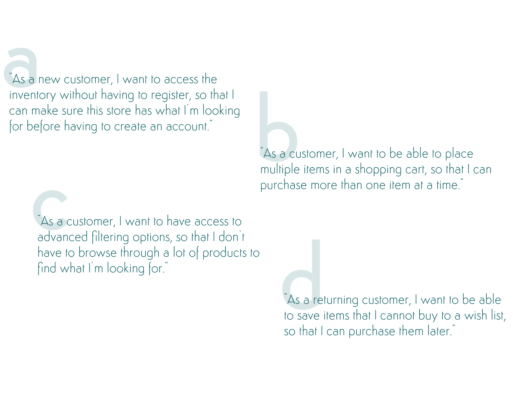
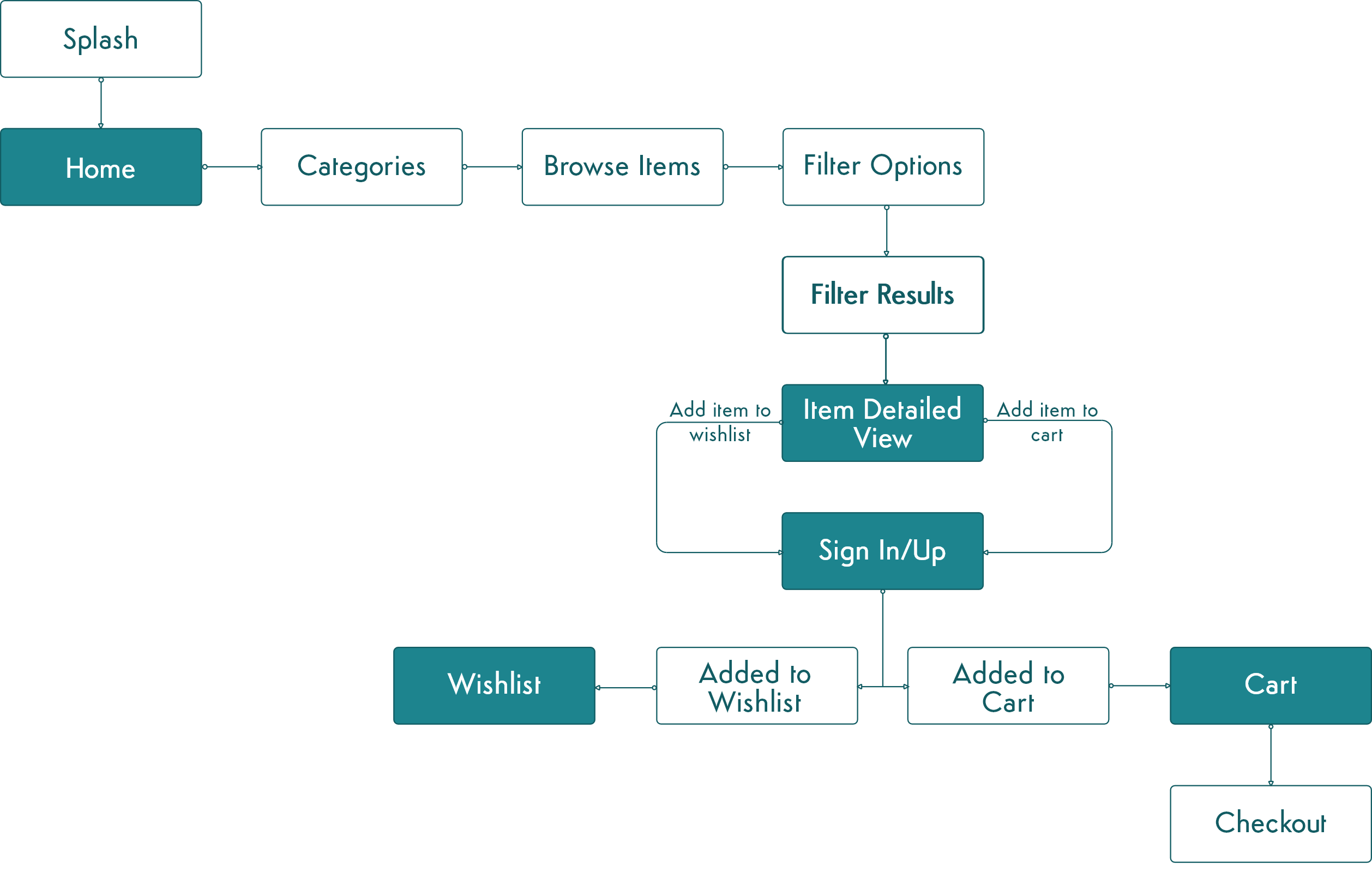

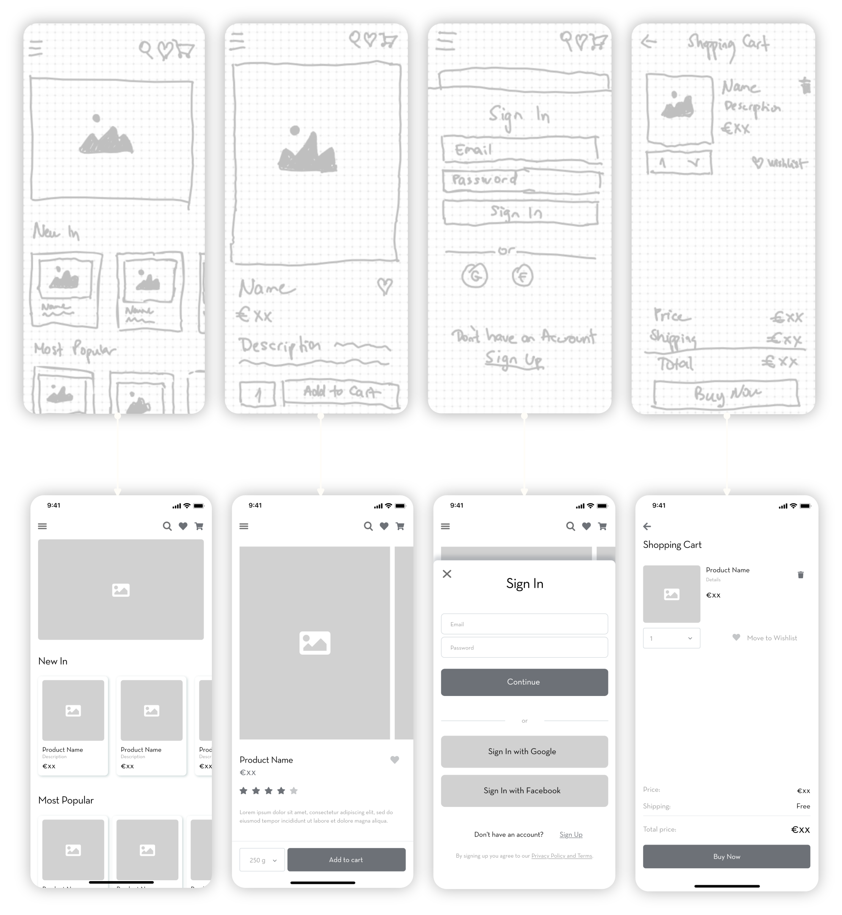

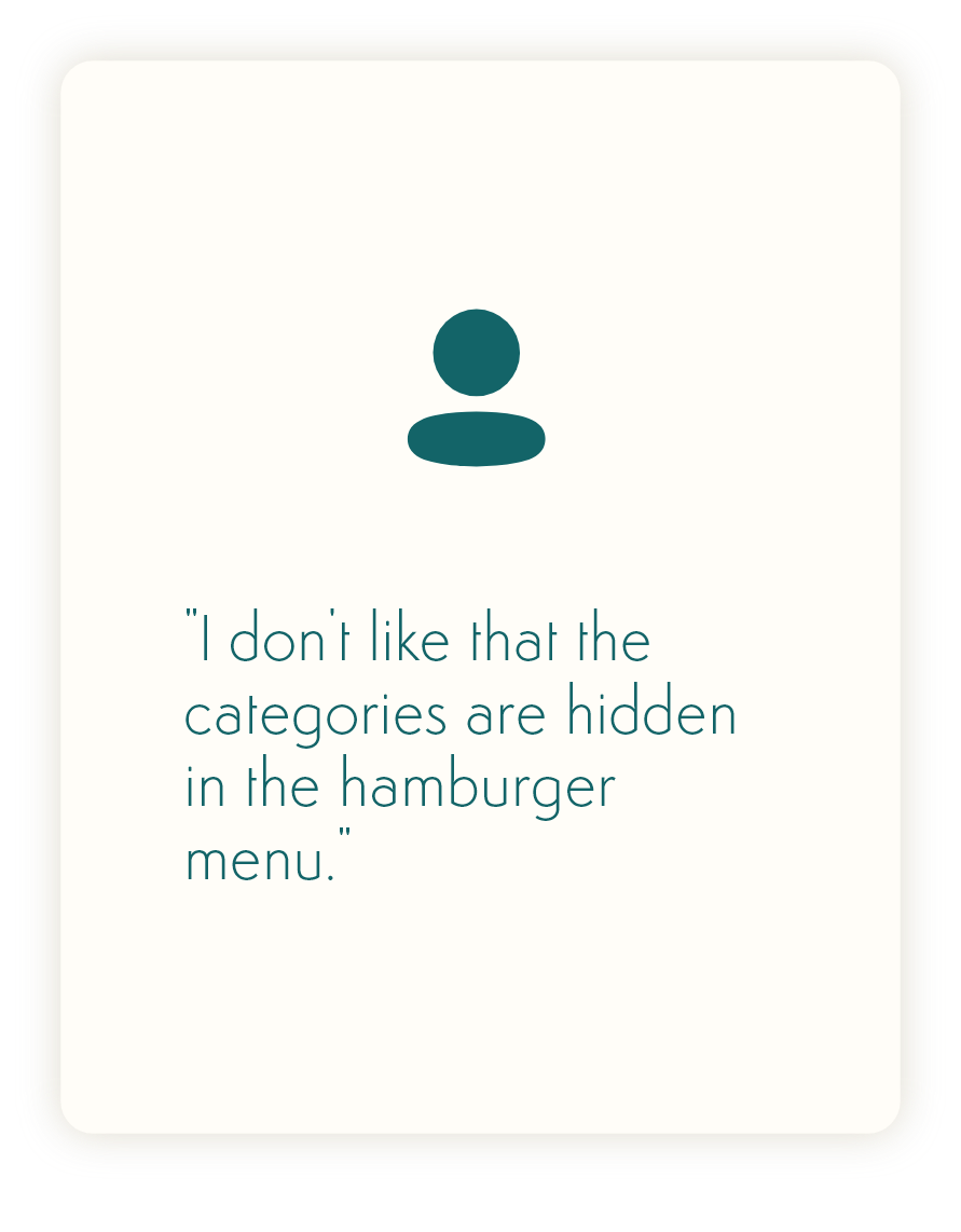
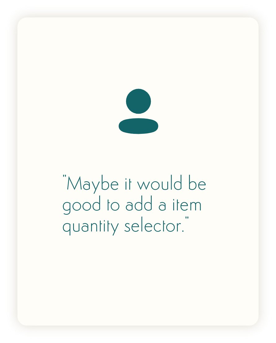
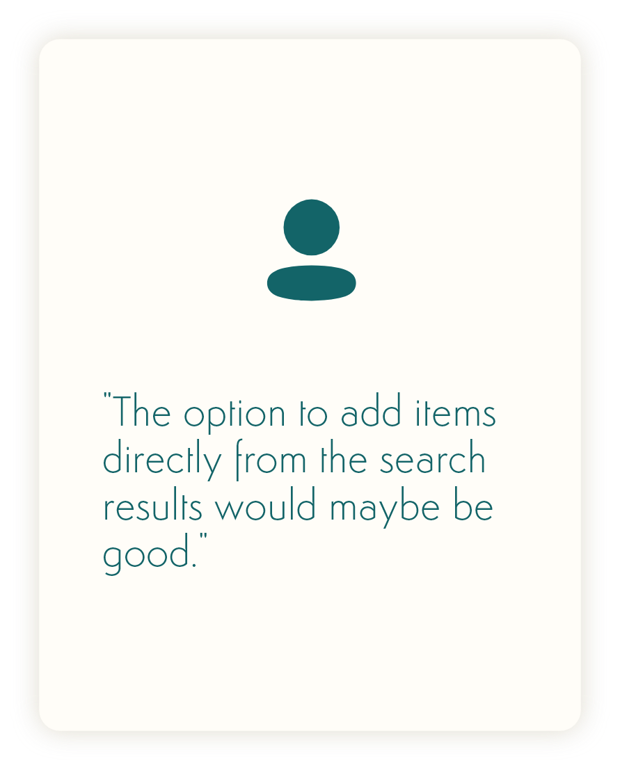


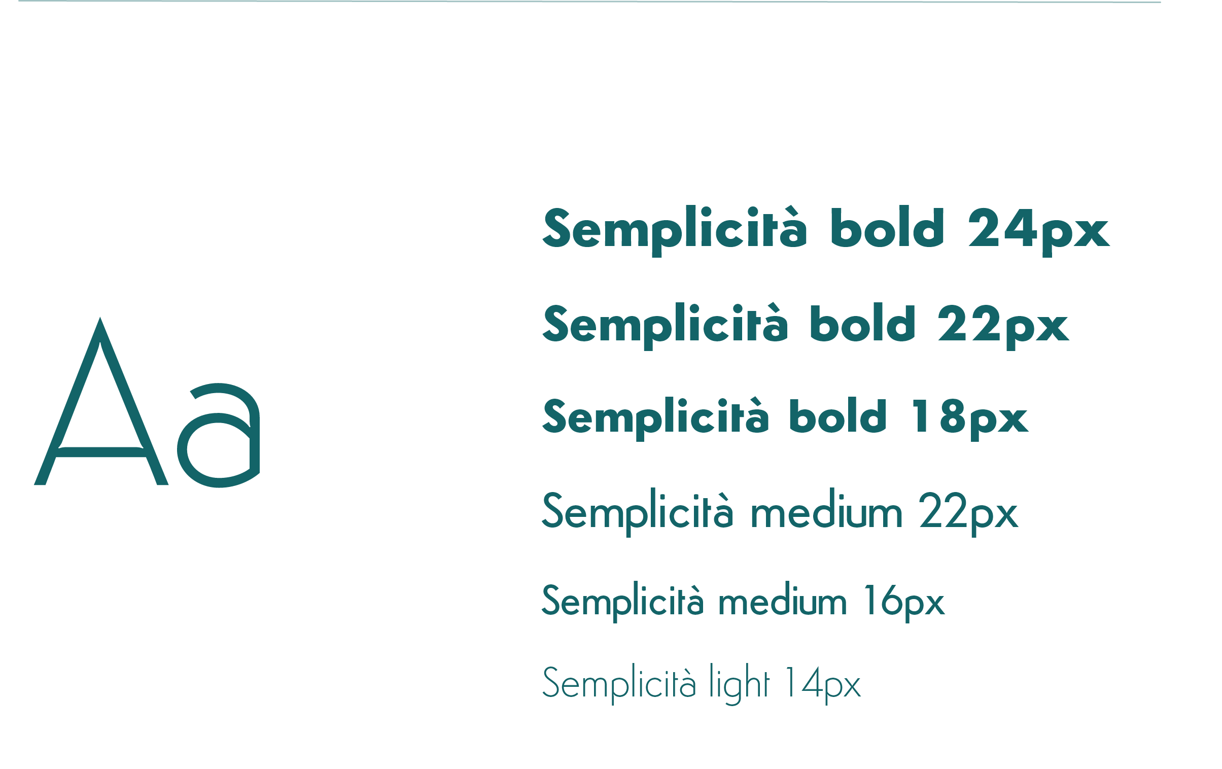
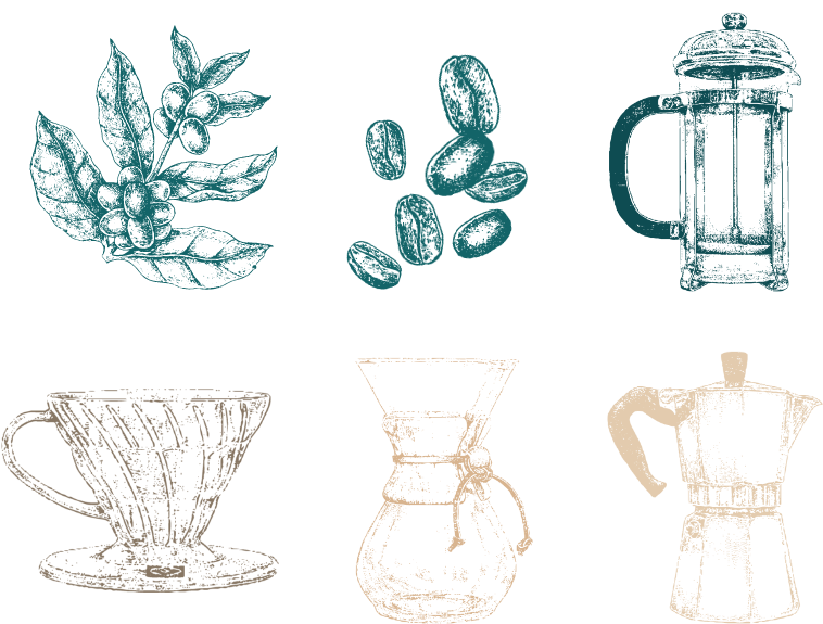
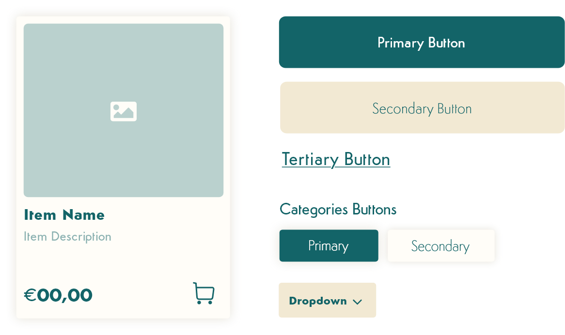


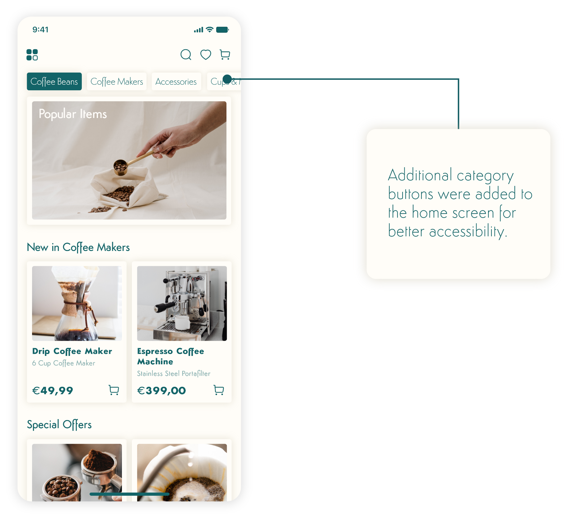
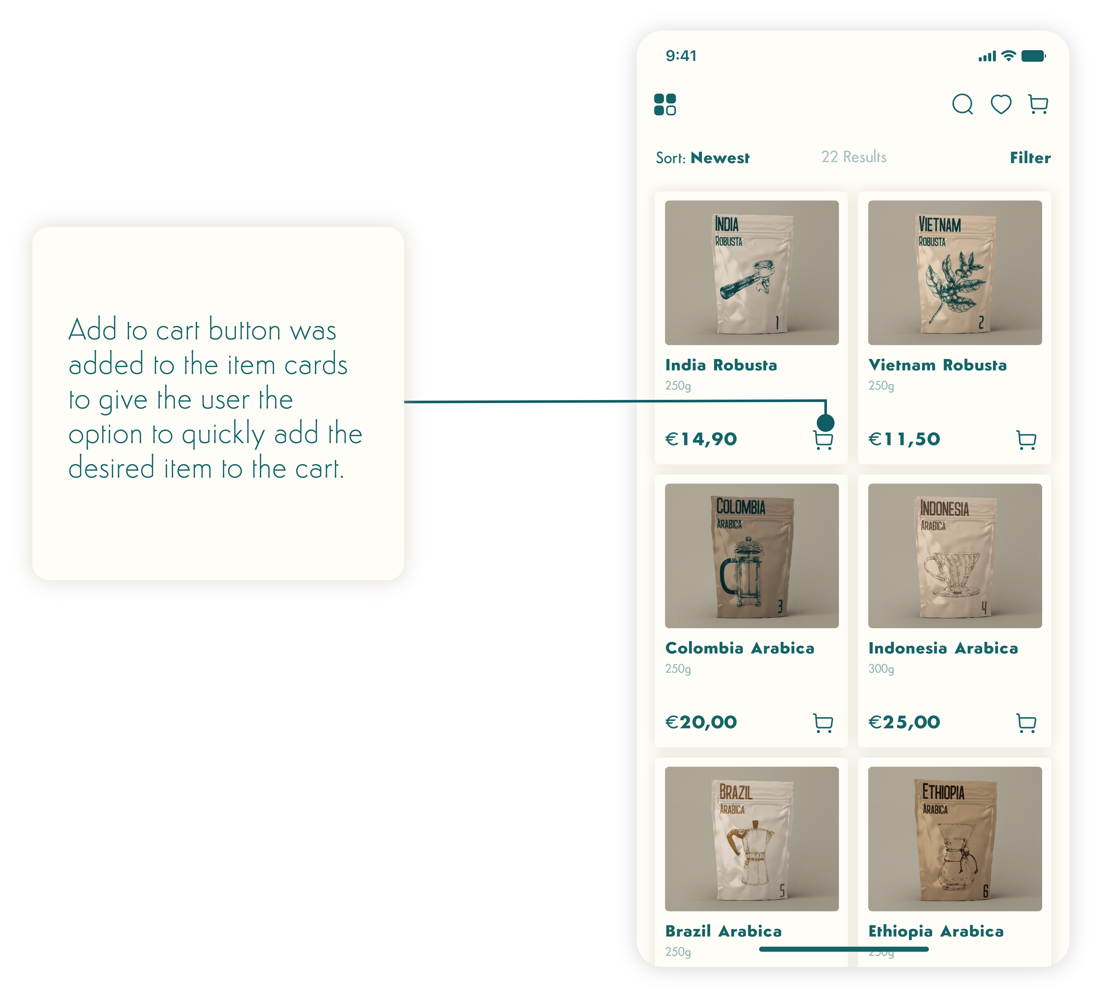
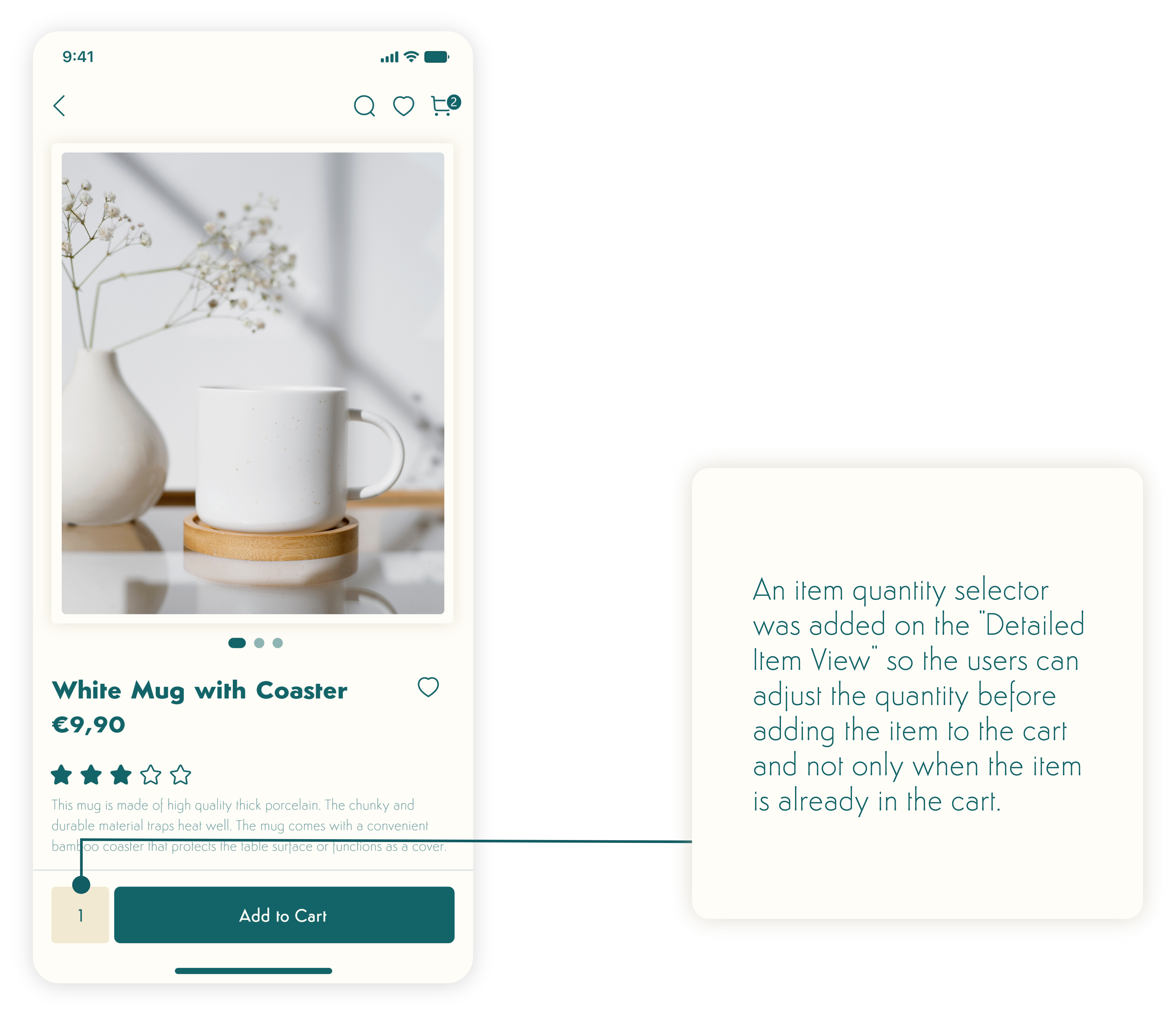

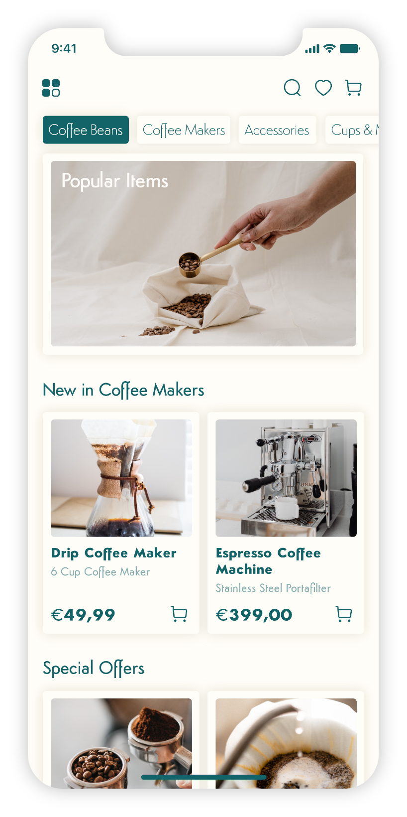
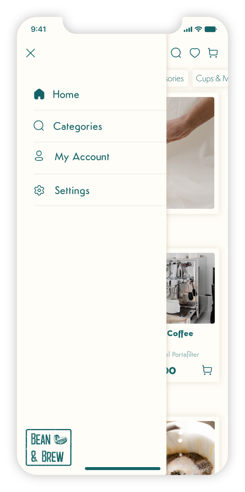
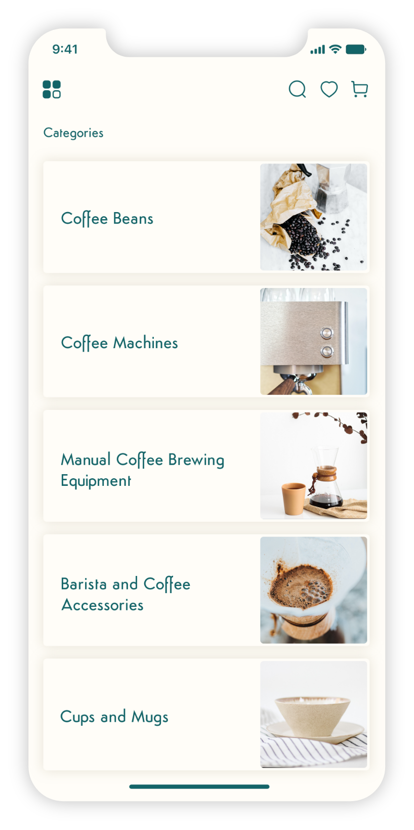
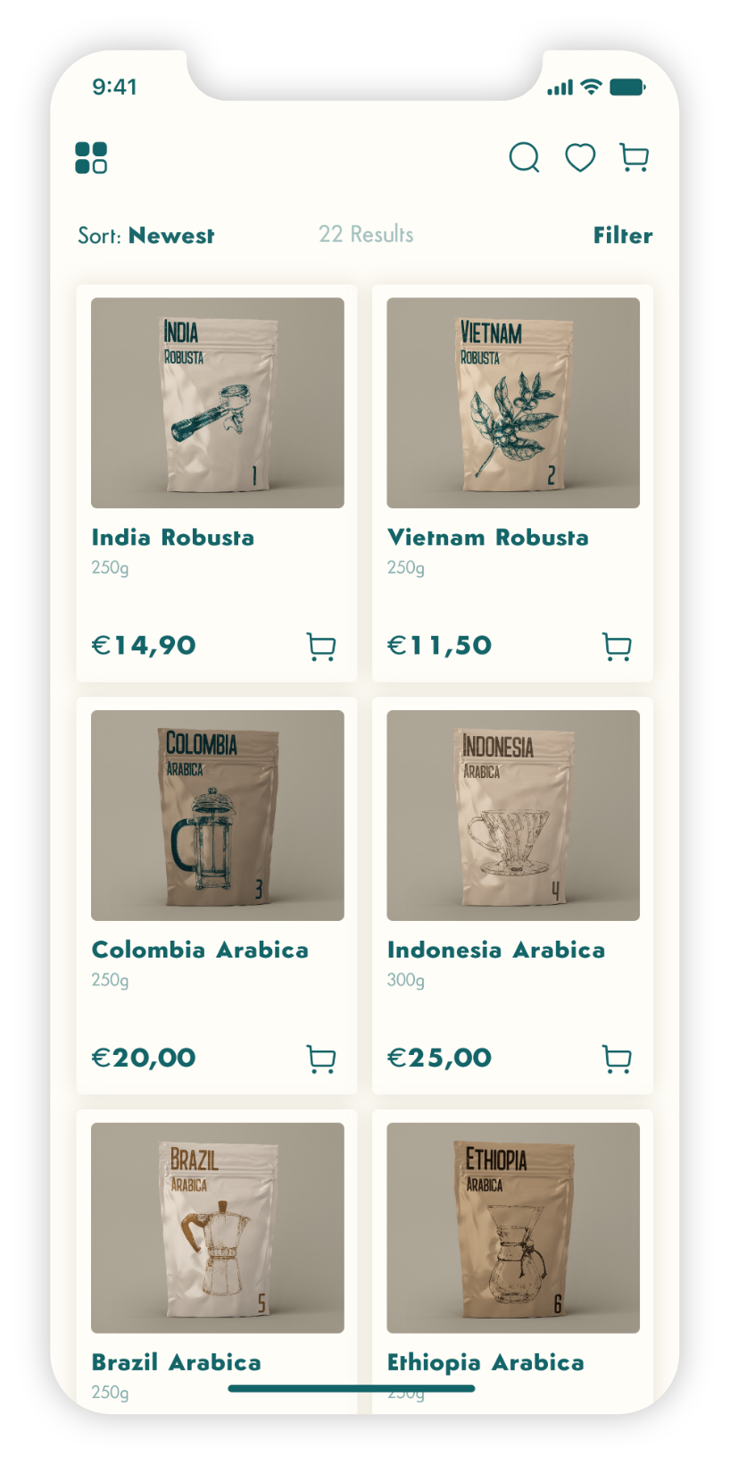
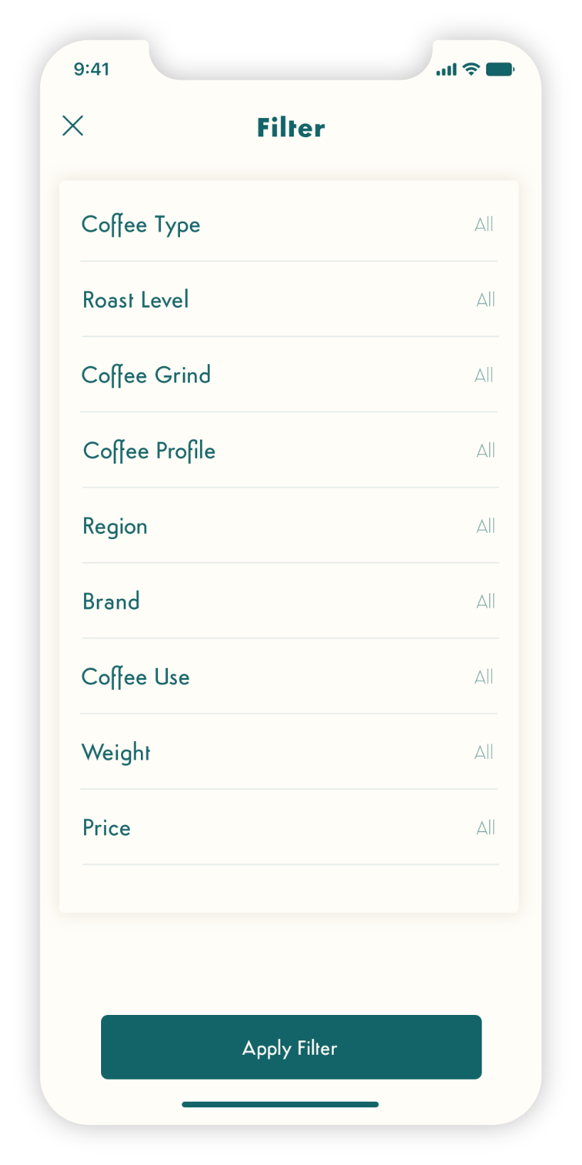
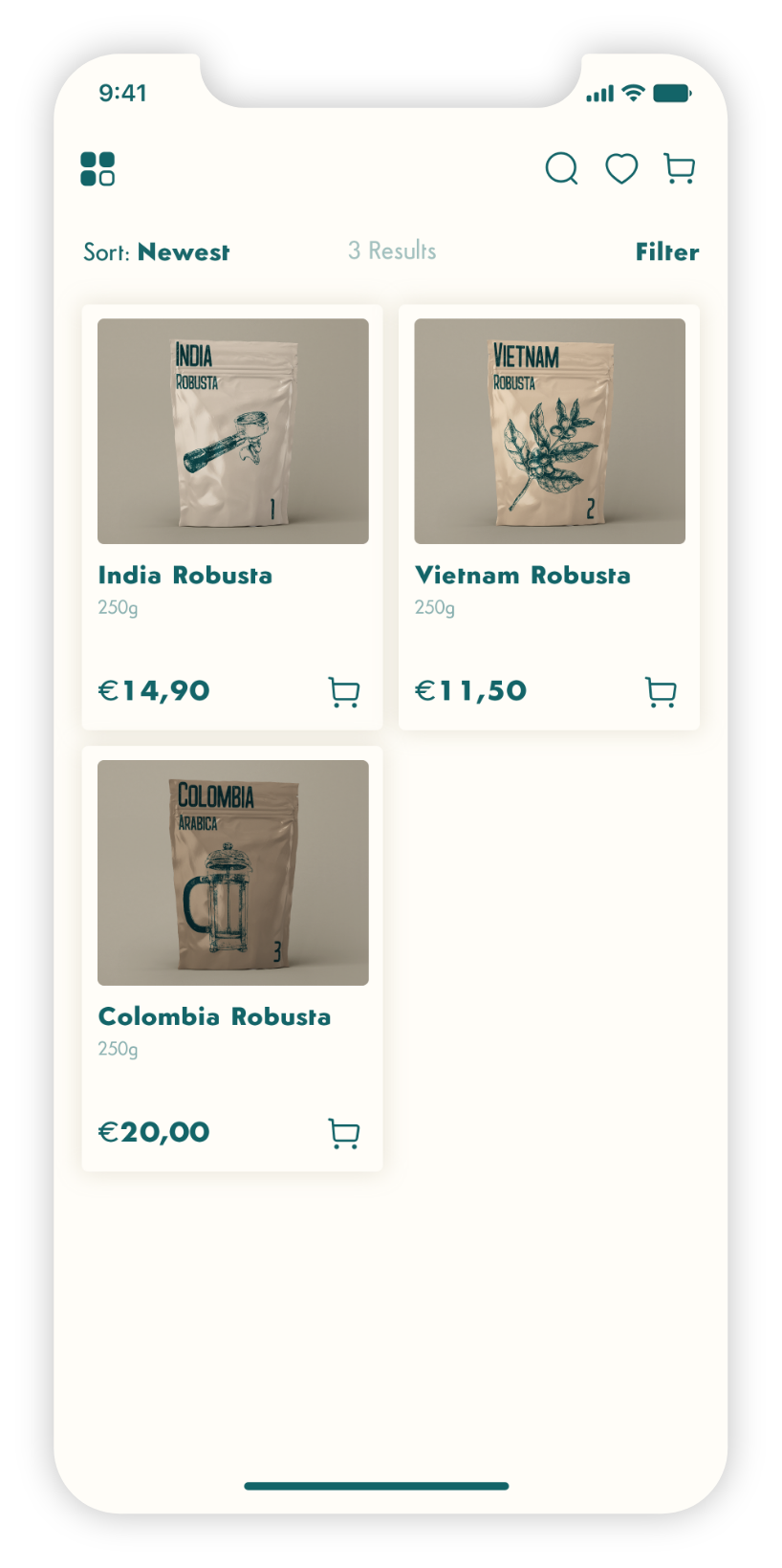
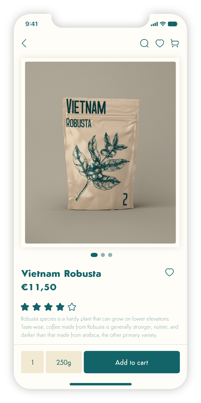
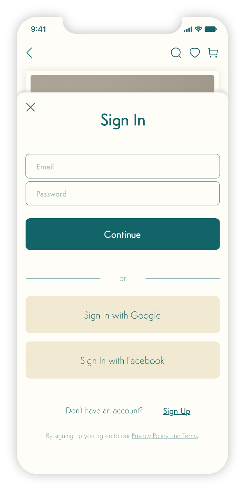
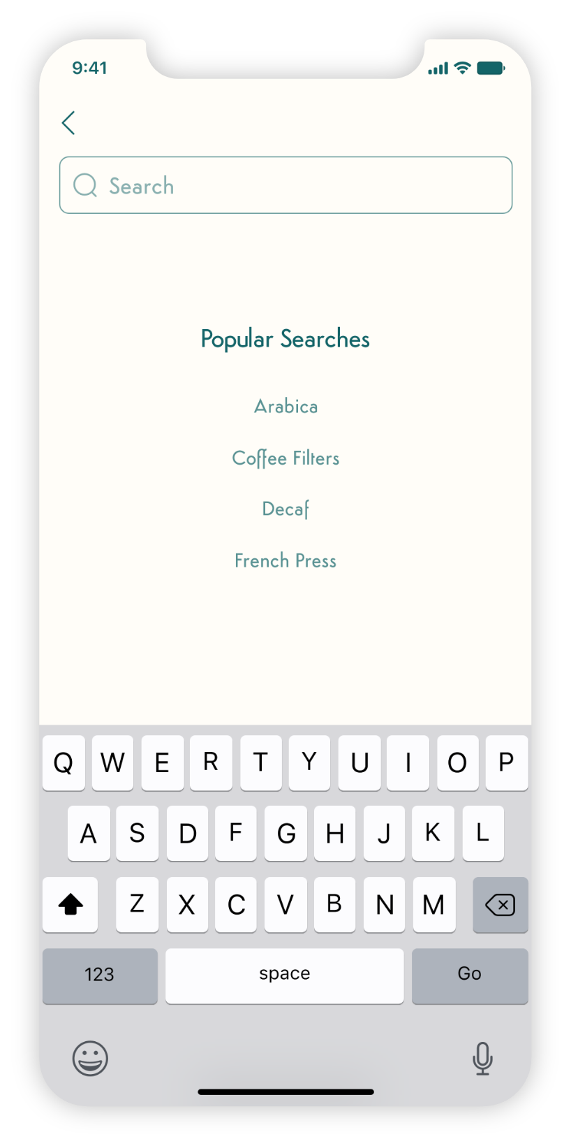
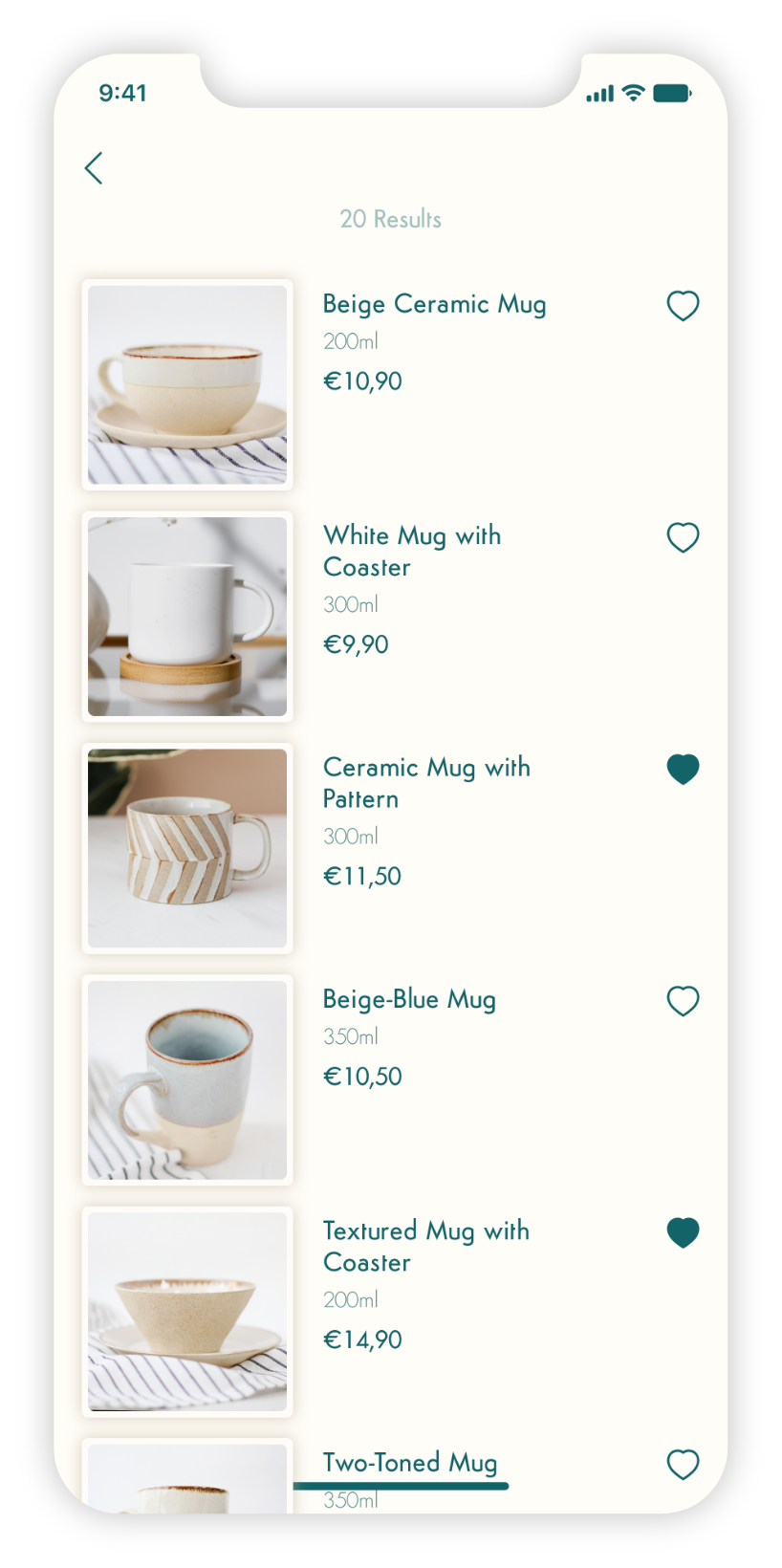
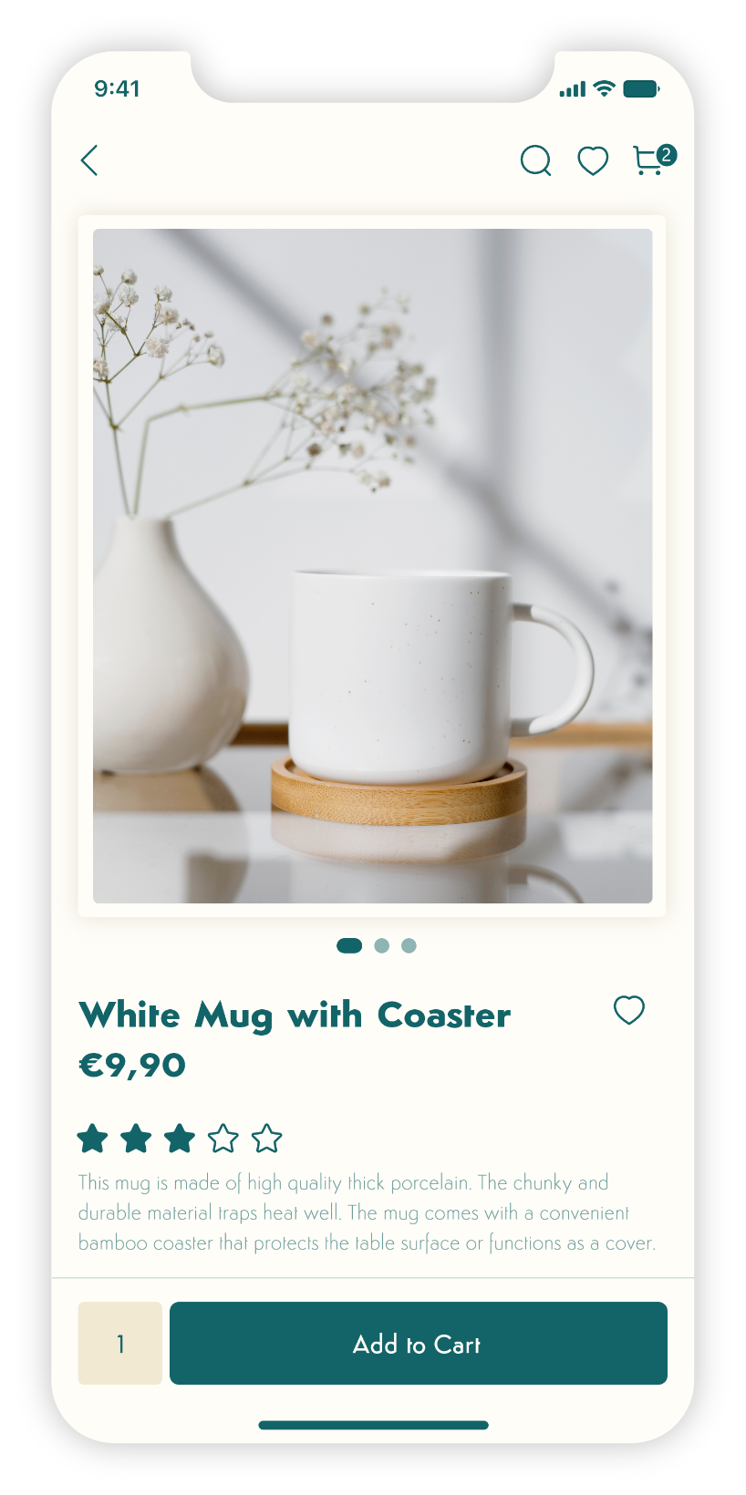
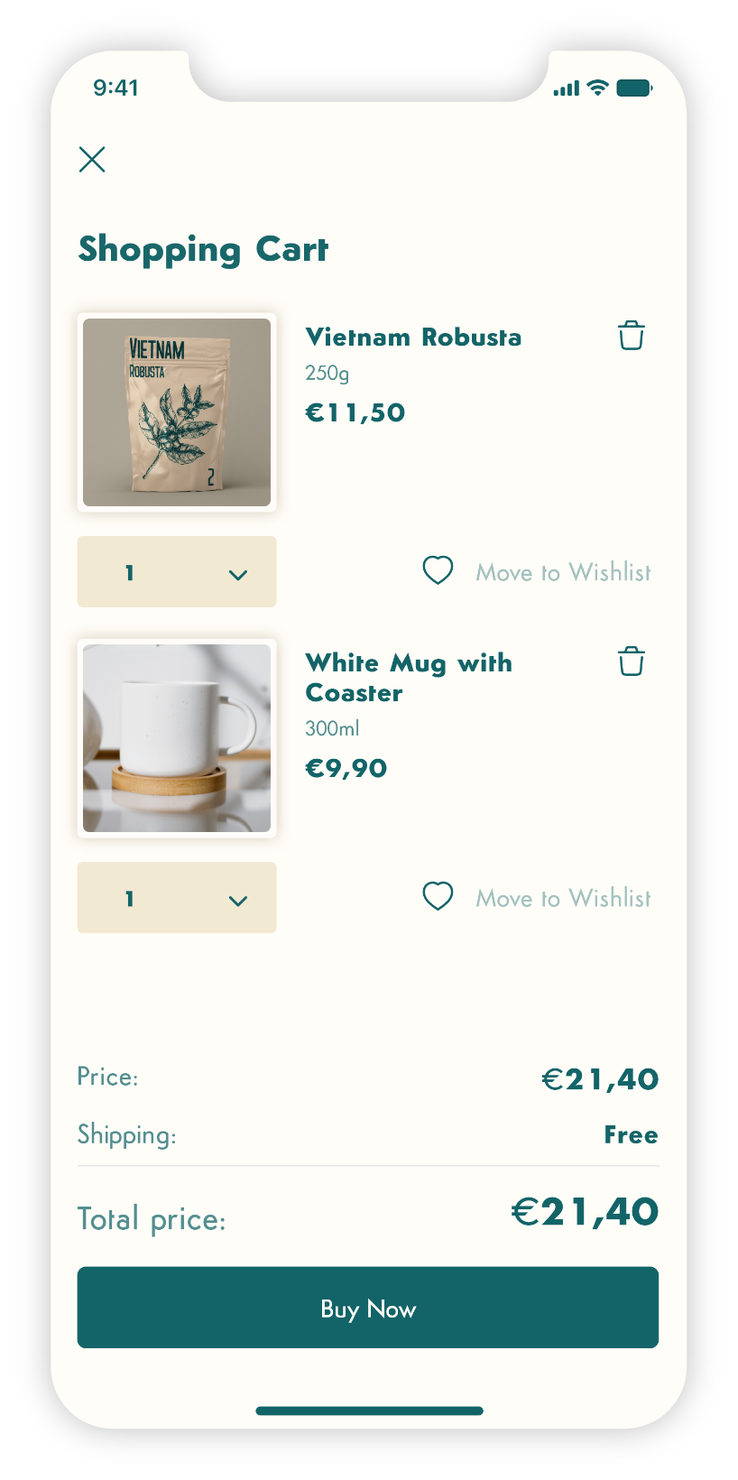
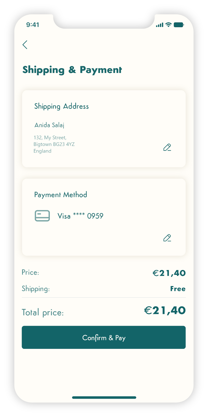
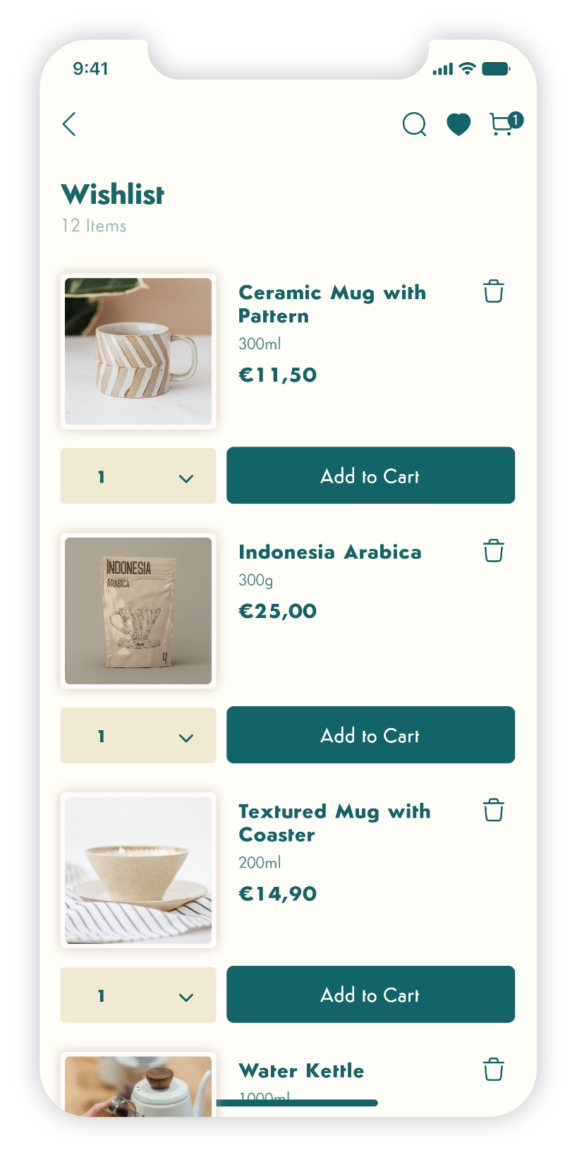
Designing the Bean&Brew online store app presented its fair share of challenges. Striking the right balance between preserving the brand's identity and ensuring optimal usability was a significant hurdle. I had to fine-tune minor design issues while enhancing the overall user experience. Integrating sustainable visual elements within the brand guidelines brought about creative challenges. Translating the brand's commitment to eco-friendly practices into a visually compelling interface demanded thoughtful consideration.
In conclusion I took a systematic and hands-on approach to solving problems through iterative steps. The final product stands as a testament to my commitment to meeting the dynamic market's evolving needs while maintaining a seamless blend of user-centric design and brand identity.
