Loading
You made it!
100%

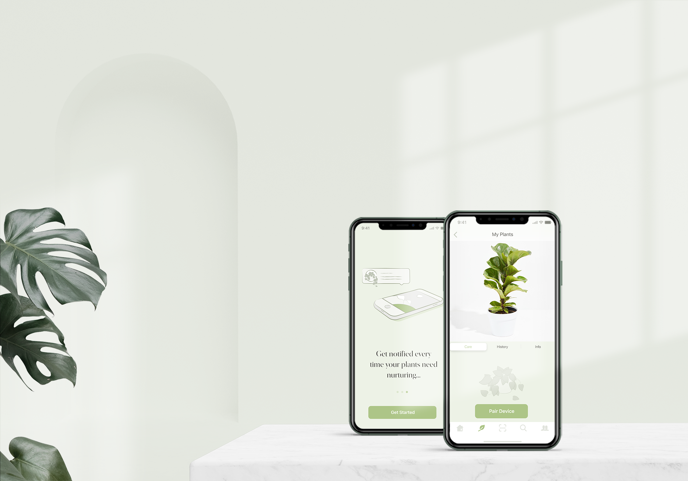
Caring for houseplants made easy
Native iOS & Android
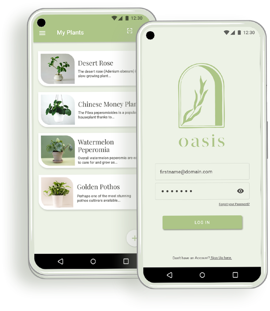
Houseplant Care App
Tools
Adobe XD
Adobe Photoshop
Adobe Illustrator
After Effects
About
Oasis is a native iOS and Android app designed to simplify houseplant care by providing users with essential information on how and when to tend to their plants. Addressing the challenge of plant care in our busy lives, Oasis goes beyond surface-level advice, offering detailed data such as moisture and sunlight levels, soil quality, and room temperature through a connected monitoring device in the plant pot.
Problem
The challenge of caring for houseplants is exacerbated by our hectic schedules, making it difficult to stay on top of watering and nourishing routines. Existing apps often provide only basic information, lacking accuracy and depth.
Solution
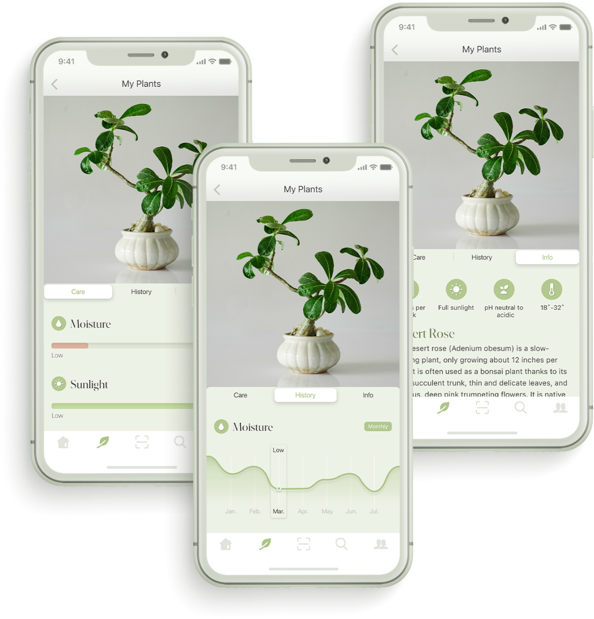
Oasis stands out by offering users detailed and accurate insights into their plants' well-being. By connecting to a monitoring device within the plant pot, the app provides real-time data on moisture, sunlight, soil quality, and room temperature.


The exploration of existing apps involved an in-depth analysis of competitors to not only understand their features and functionalities but also to delve into the nuances of the user experiences they offered. This phase aimed to identify trends, patterns, and pain points in the current landscape of plant care applications.
After closely examining the competitive landscape, I identified precise areas requiring enhancement. These ranged from refining the user interface to integrating features that were not only relevant but addressed the identified pain points. This step was crucial in ensuring that Oasis not only met the baseline expectations of users but exceeded them by providing solutions to challenges often overlooked by other applications.
Blossom
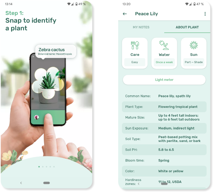

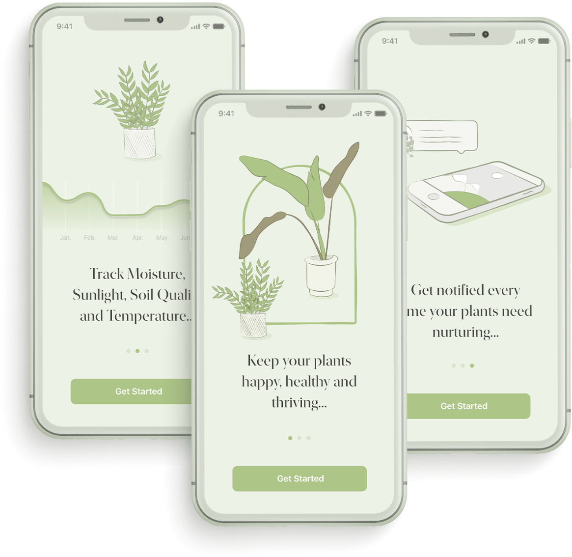
The Onboarding helps users understand the key features of the app.
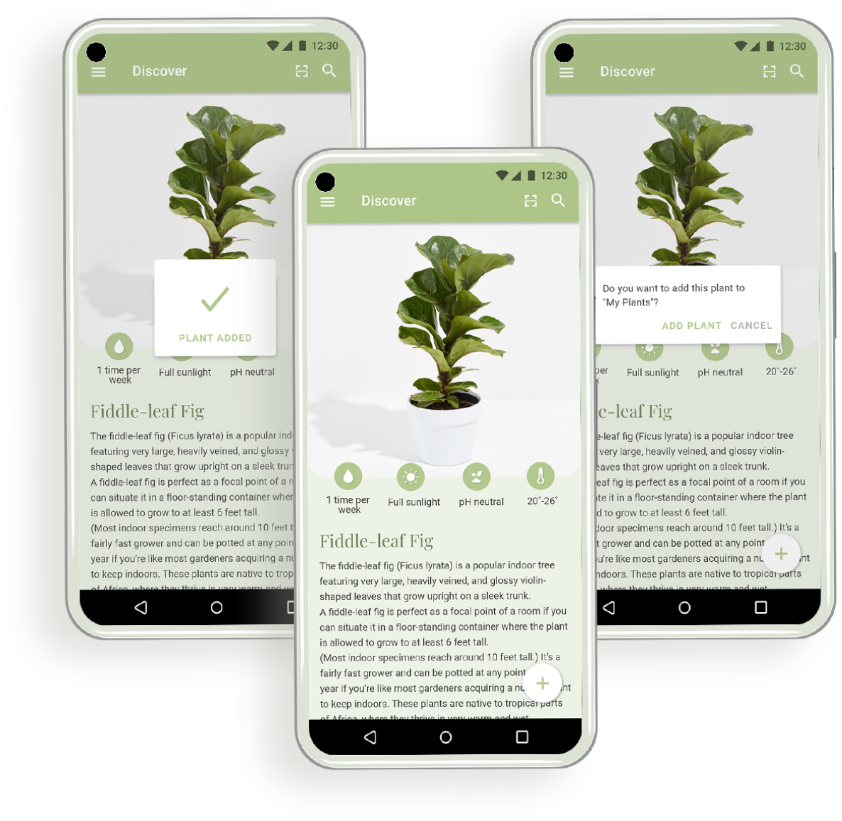
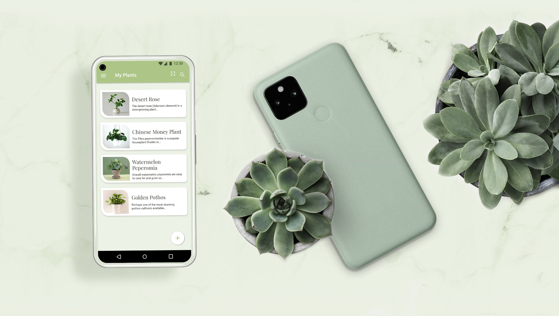
The App has a big database of plants.
Users have access to reminders with information on plant care.
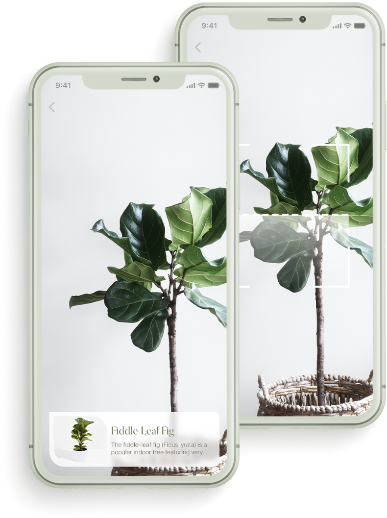
Users can take a picture of their plant to identify it and to add it to their profile.

The information provided may not always be accurate.
WatchFlower
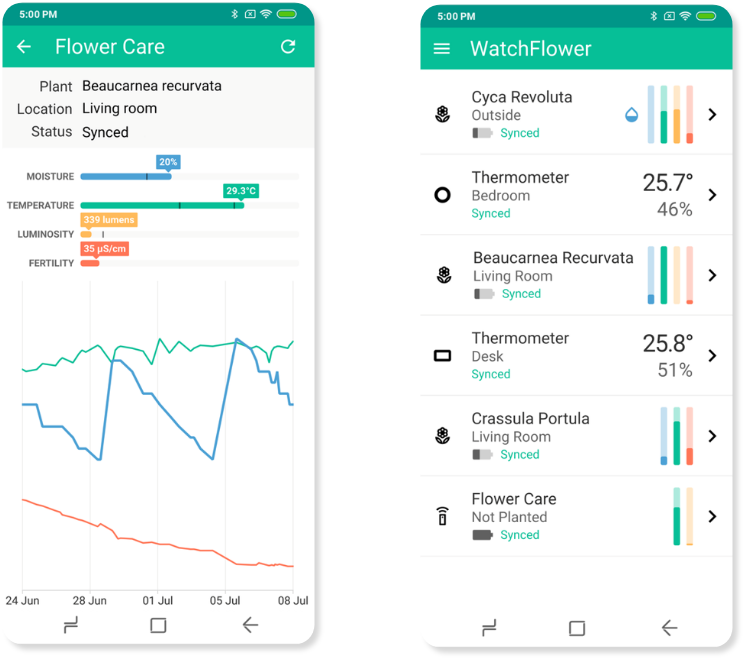
The App enables the user to pair the app with a monitoring device and gathers and organizes the data.
The user is provided with the daily data on the moisture, temperature, luminosity and fertility, and there is also an option to see the progress.
The overall design is not very appealing or engaging.

A meticulous and comprehensive user flow was crafted to guide users seamlessly through the application. This involved mapping out the logical sequence of interactions, ensuring a user-friendly journey from onboarding to the utilization of advanced features. The user flow aimed to strike a balance between simplicity and depth, aligning with the app's goal of providing detailed yet accessible information.


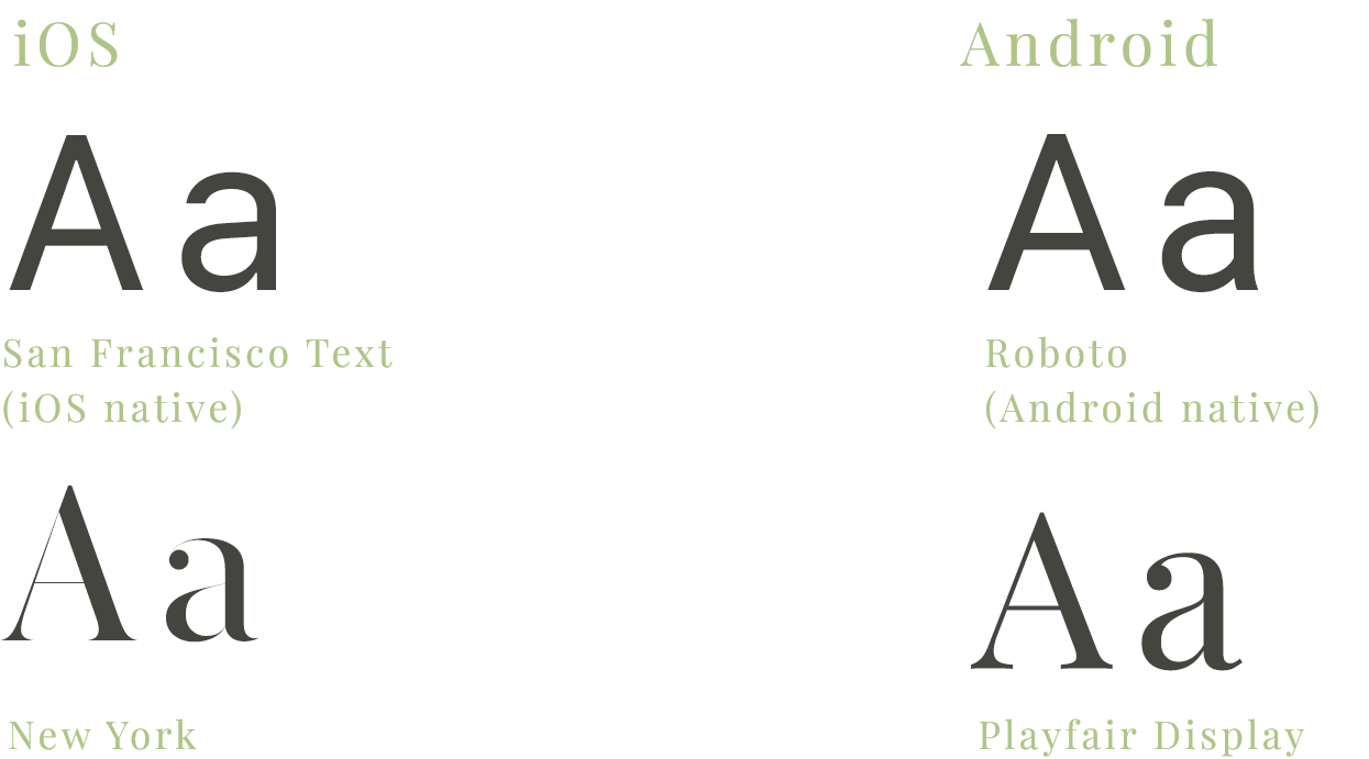
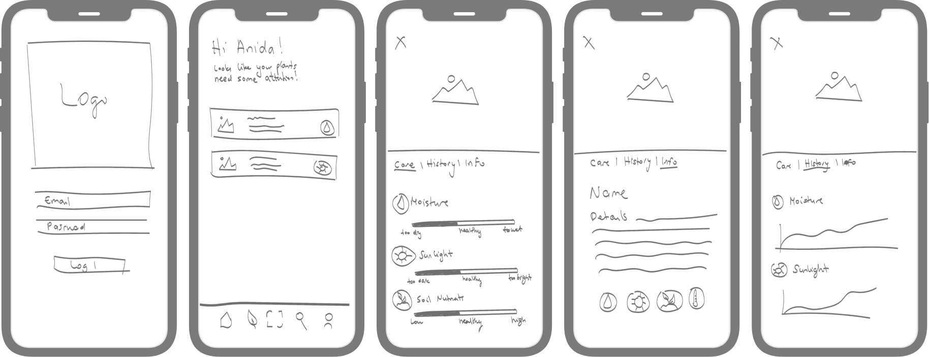
The next step was to create rough sketches of the screens, based on the user flow. Designing native iOS and Android applications meant that I had to stay true to the iOS and Material Design guidelines. In order to do that I had to do some research and get familiar with them first.
Icons
iOS

Android

Illustrations/ Animations

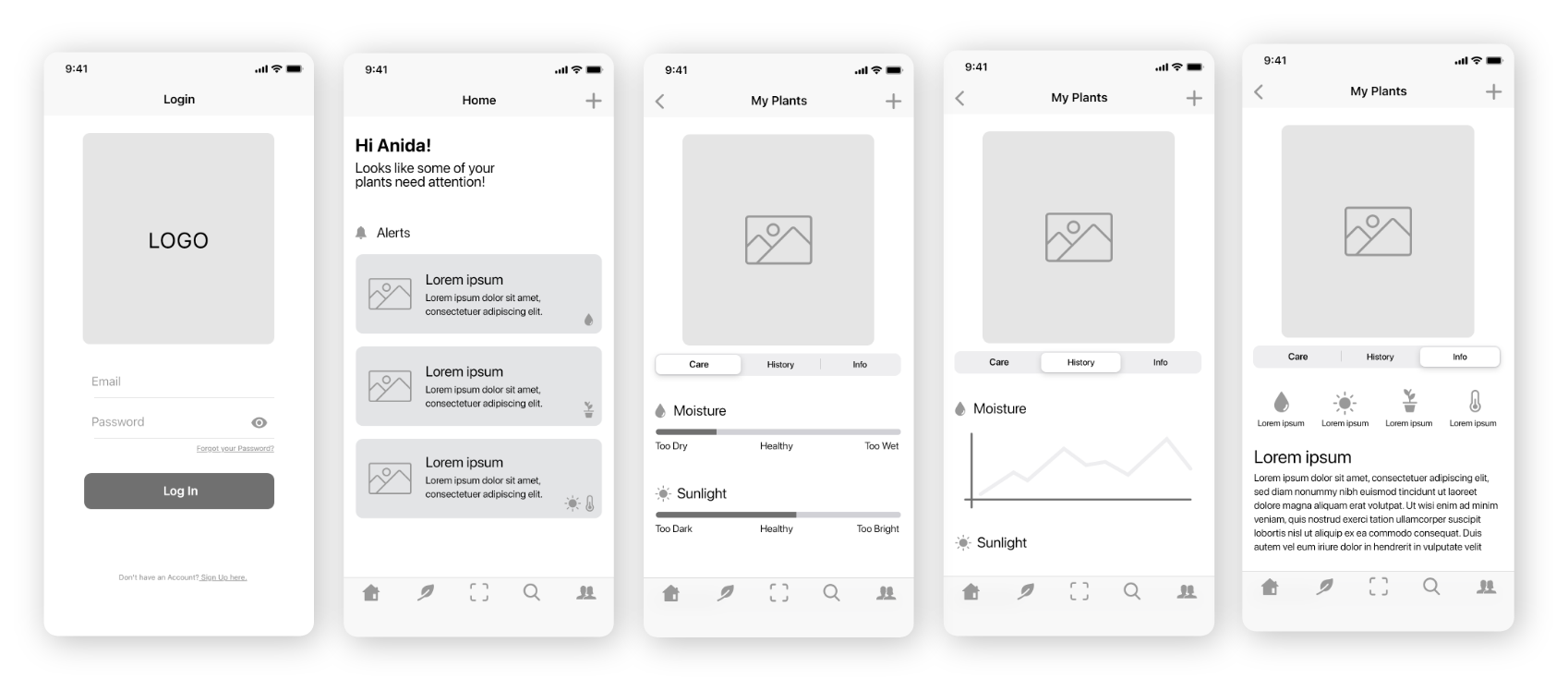
Login/Home Screen
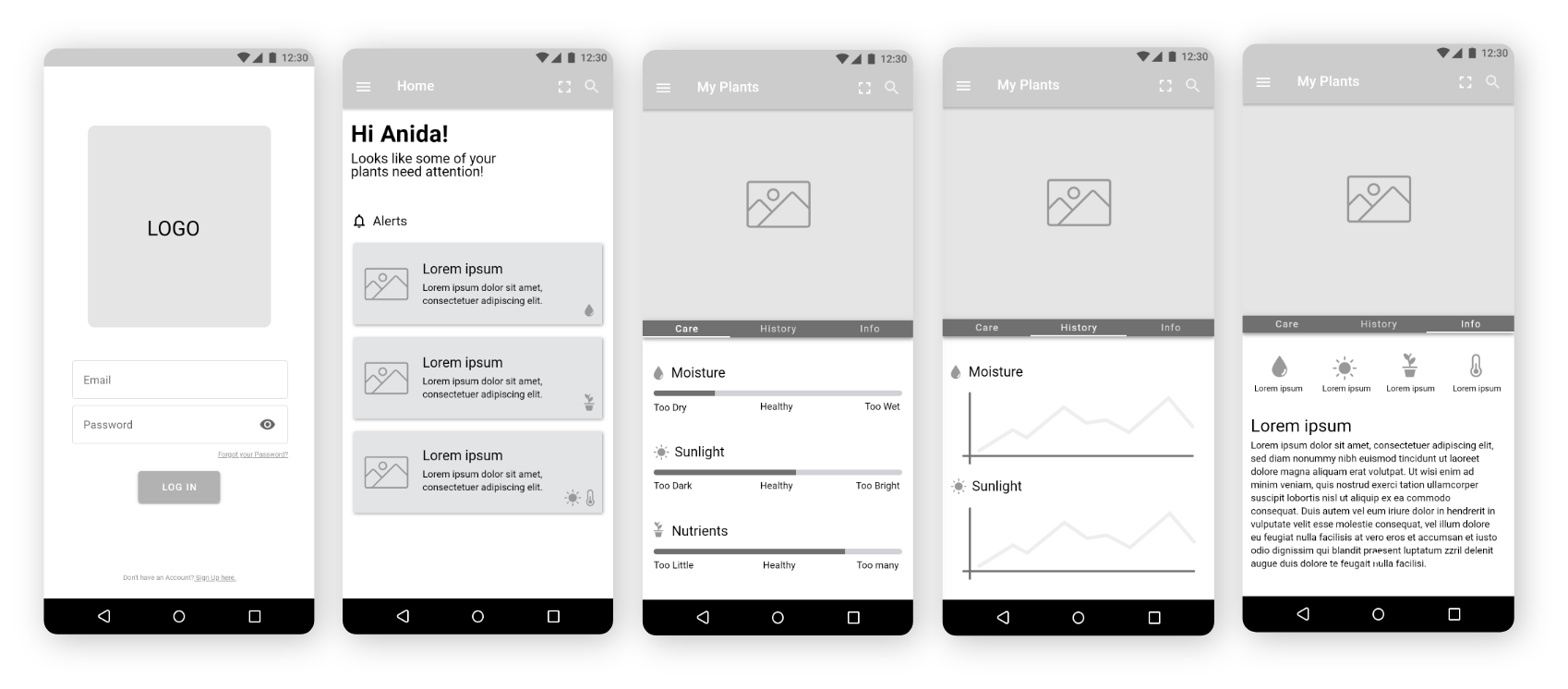
Android
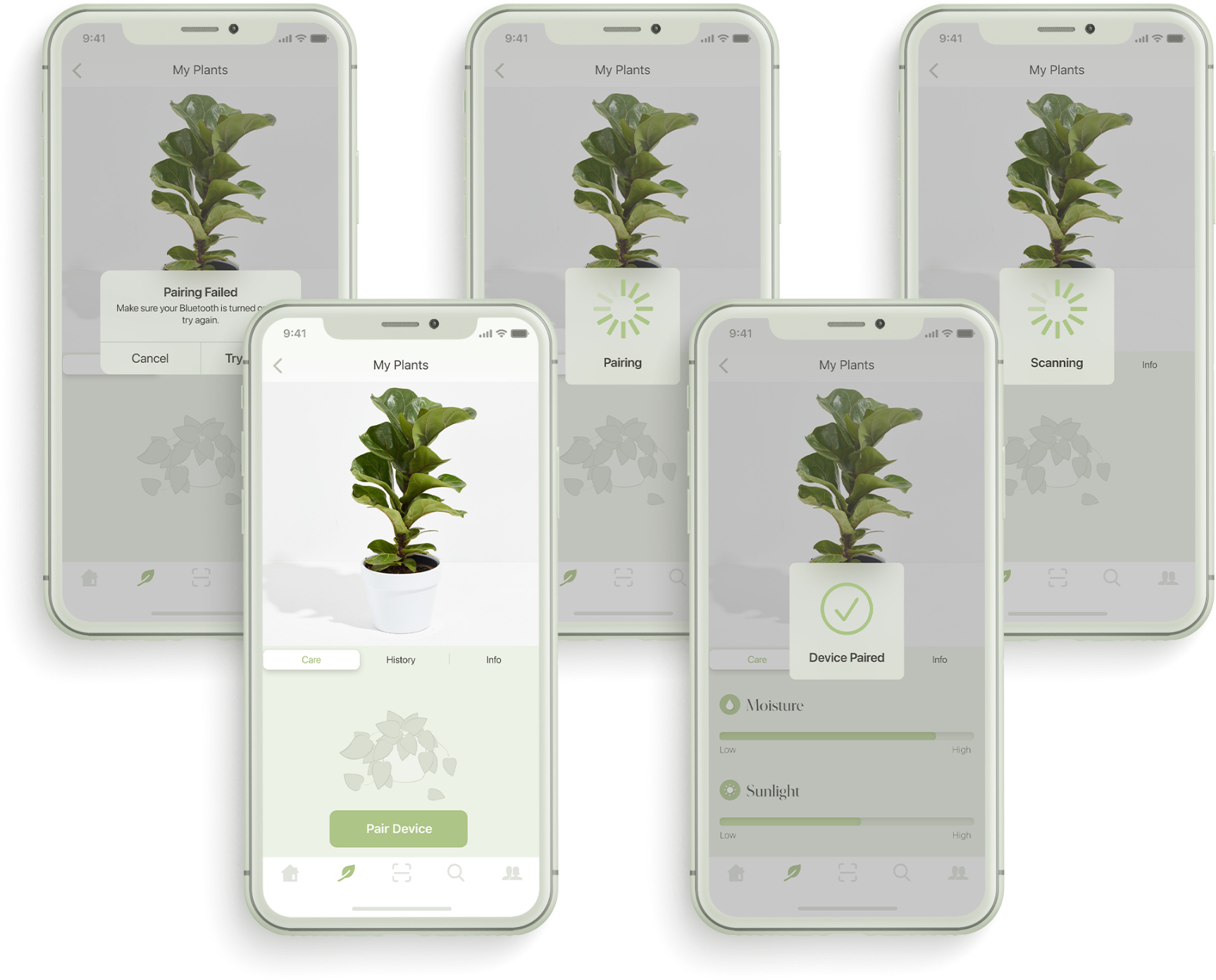
Pairing Monitoring Device
iOS

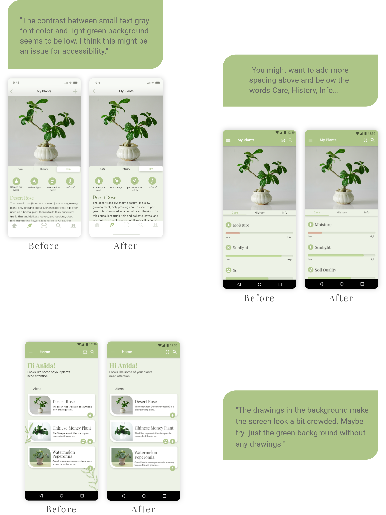
In order to provide optimal performance and user experience on both iOS and Android, I developed separate prototypes for each platform. User testing became a critical phase to gather real-world feedback. Users interacted with the prototypes, providing insights into usability, navigation, and overall satisfaction. This iterative process allowed for fine-tuning the design based on user preferences, ensuring that the final product met the needs and expectations of the target audience.
User Feedback
Challenges
I faced various challenges during the design process of this app, and I implemented strategic solutions to overcome them.
1. Adhering to Platform GuidelinesChallenge: Designing for both iOS and Android while following their guidelines and maintaining a consistent app identity.
Solution: Conducted thorough research on both platform guidelines, creating a design that respected each, providing a seamless experience for users on both platforms.
2. Visualizing Complex DataChallenge: Conveying detailed plant information in an easily understandable format.
Solution: Used clear data visualizations, like graphs and color-coded indicators, to simplify complex information and enhance user comprehension.
3. Iterative User Testing
Challenge: Navigating diverse user feedback from prototype testing.
Solution: Adopted an iterative design approach, making gradual adjustments based on user insights. Prioritized feedback, addressing critical usability concerns while maintaining design consistency.