Vegan Japanese-inspired recipe web app

About

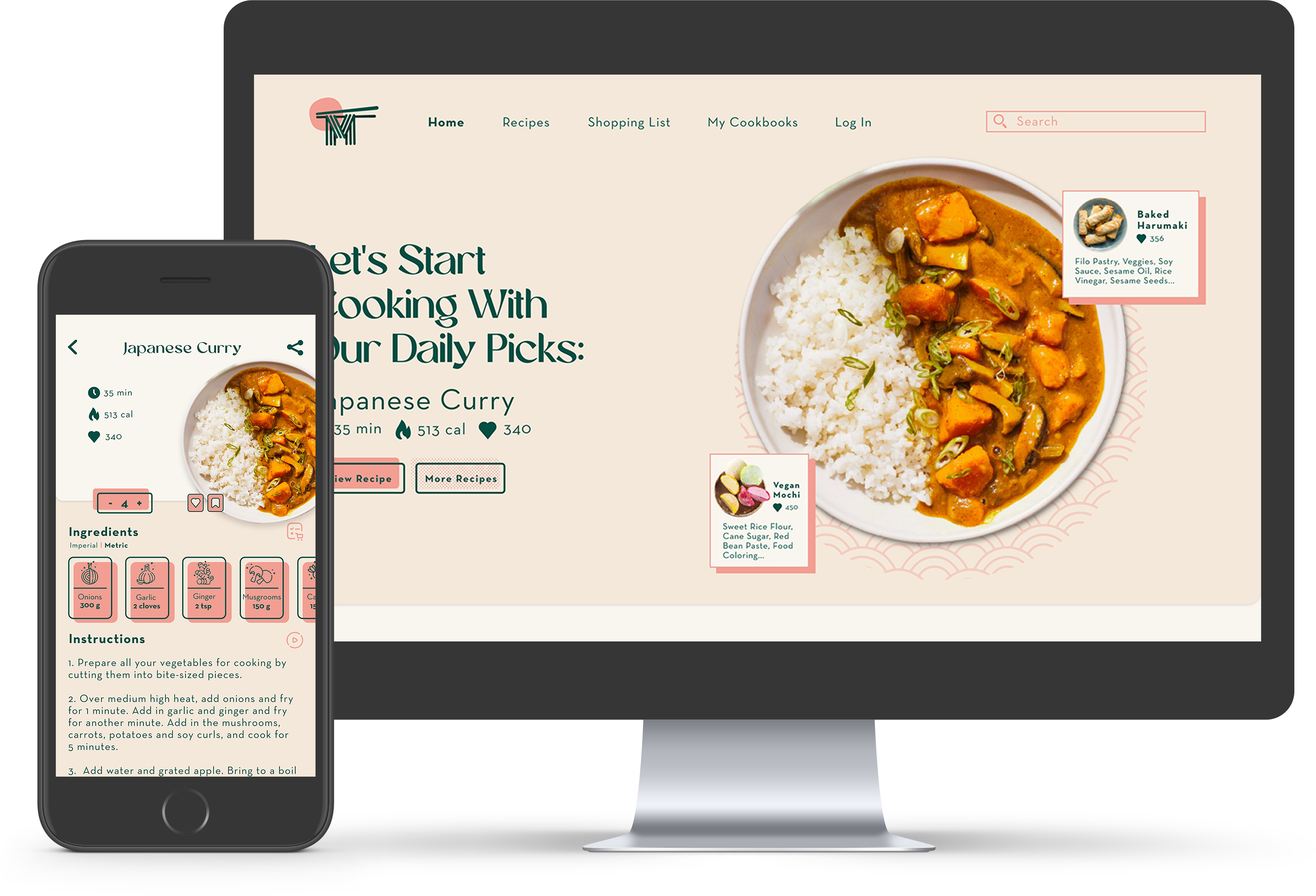
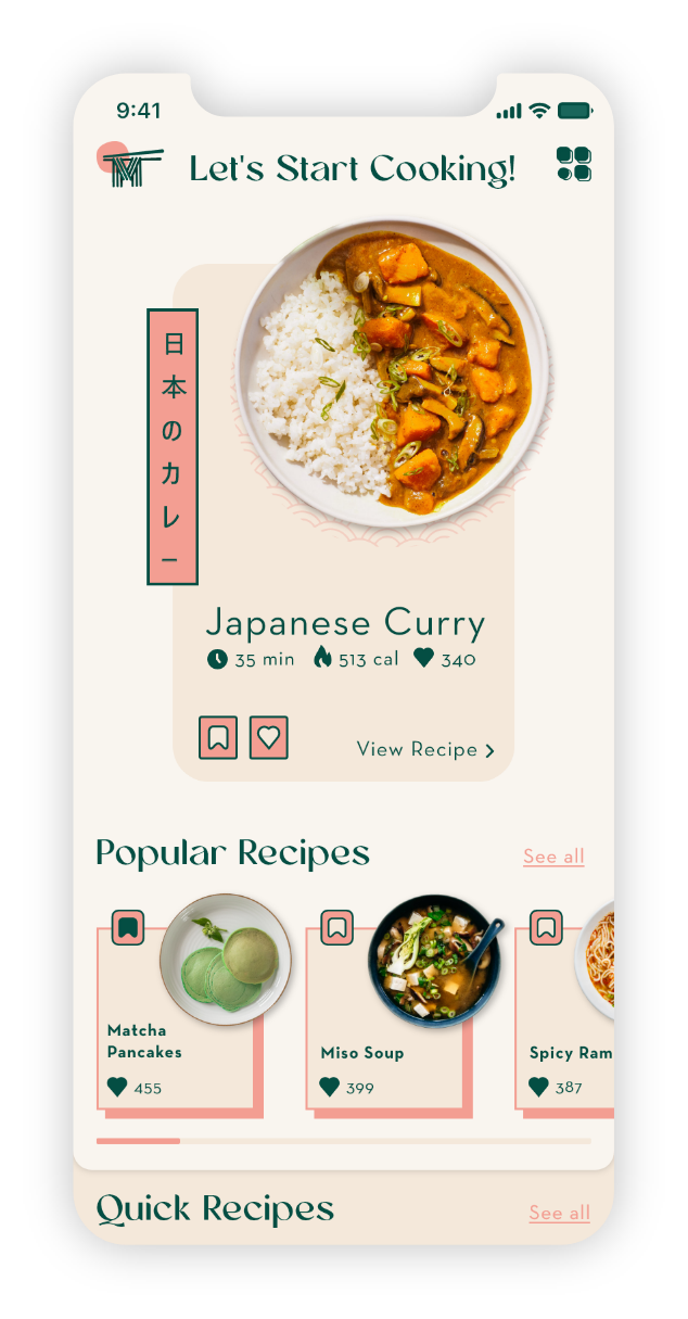
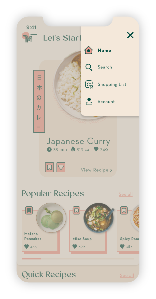
MIDORI is a responsive recipe web application that centers around vegan Japanese-inspired cuisine. The web app will allow users to browse a big database of vegan recipes with easy-to-follow cooking instructions for an overall more enjoyable cooking experience.

My Role

UX/UI Designer

Tools

Adobe XD
Adobe Photoshop
Adobe Illustrator

Timeline

4 Weeks

Problem

Finding good, easy-to-prepare Japanese-inspired vegan recipes is quite a task. Navigating through all the different websites and managing your favorite recipes can be even worse. Many users are therefore presented with a big issue when wanting to cook new recipes or recreate known recipes.

Solution

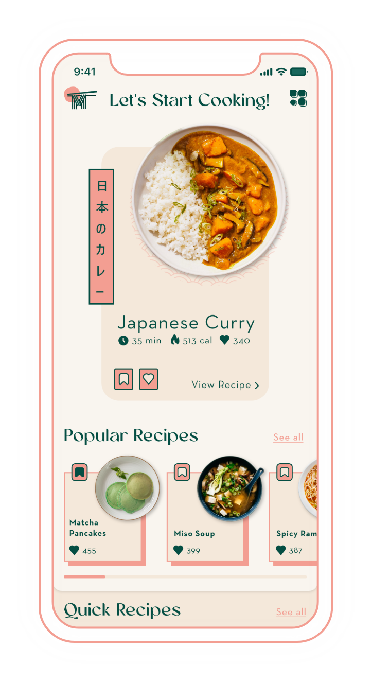
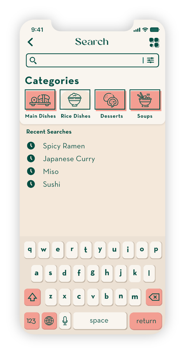
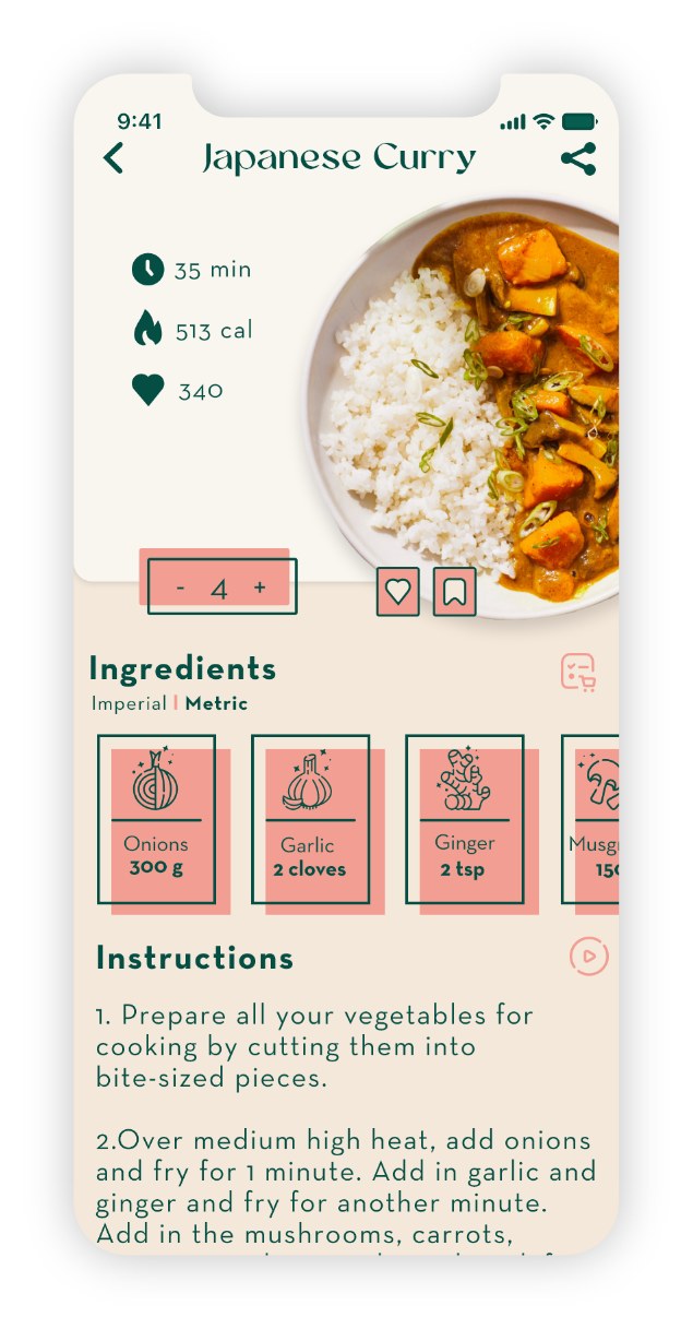
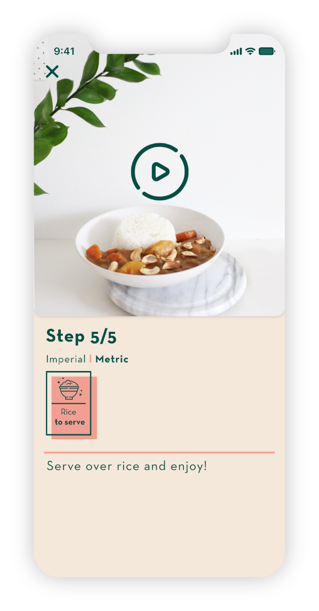
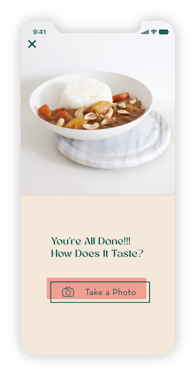
This app will make the search for recipes as easy as possible for the users. With a wide variety of vegan Japanese-inspired recipes, the users will be able to try new things or recreate their favorite meals with little effort. The recipes will be well organized and easy to prepare with the help of simple cooking instructions.

Design Process
Competitive Analysis

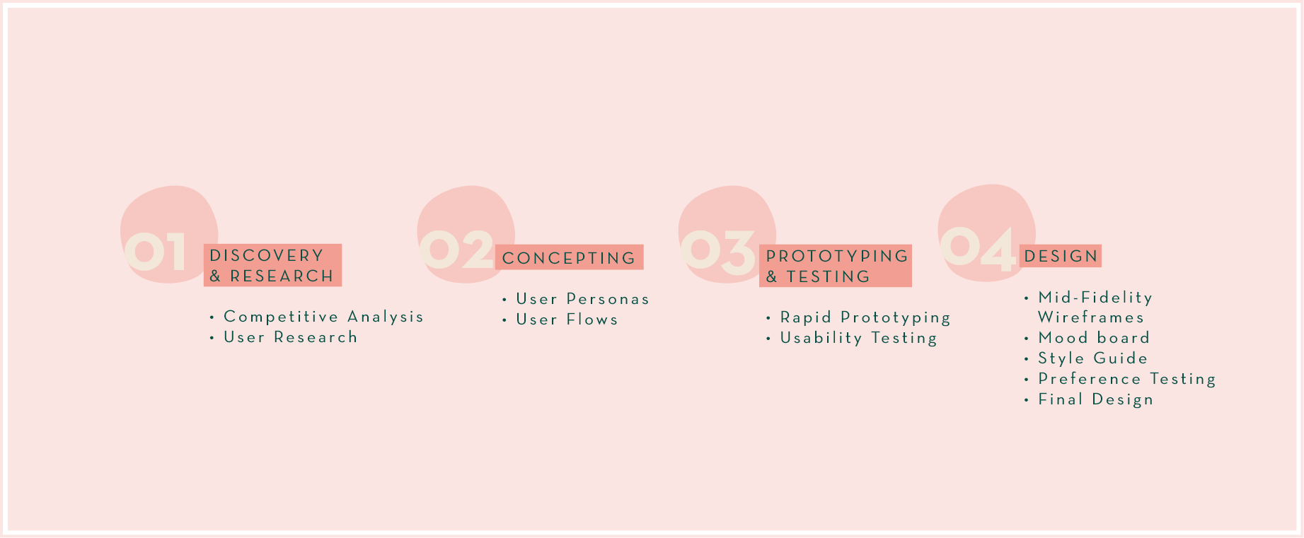
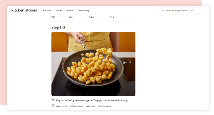
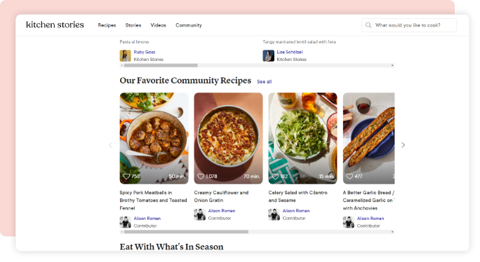
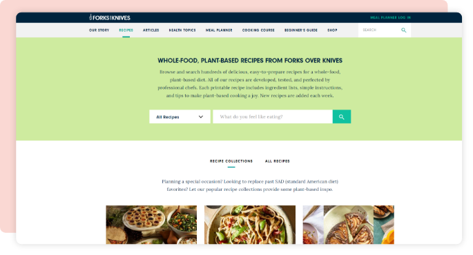
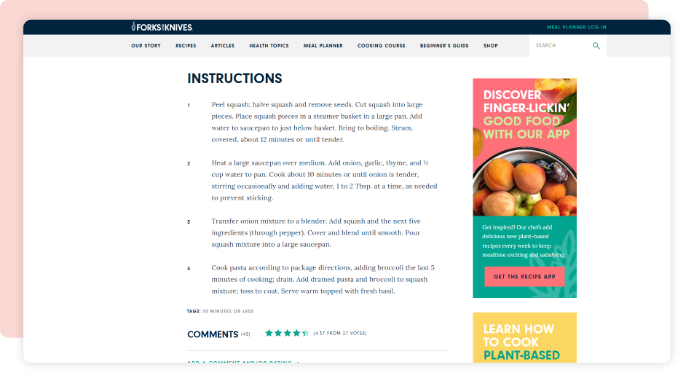
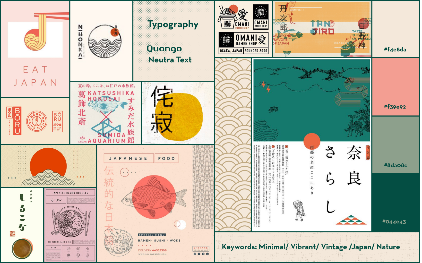
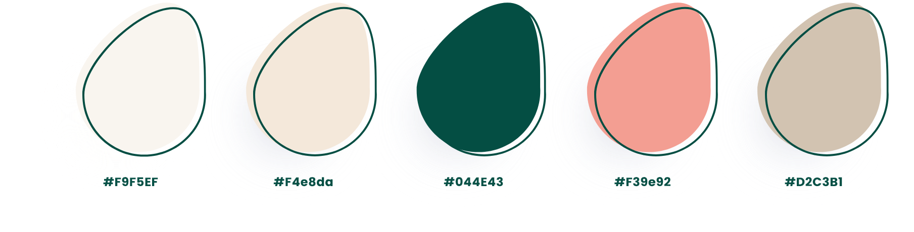
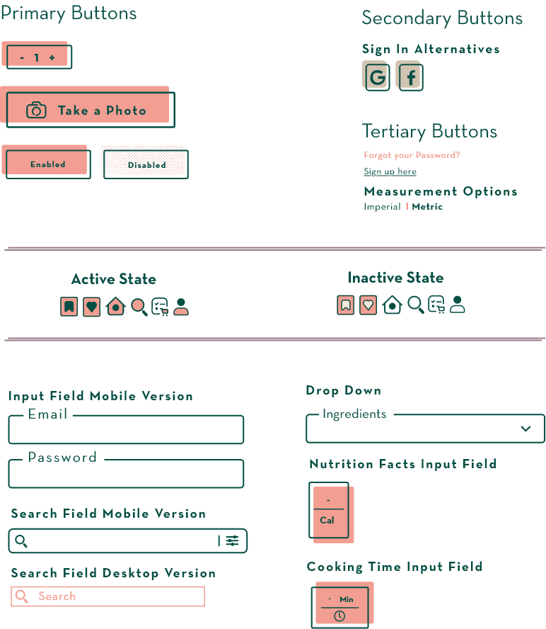
In the first stage of the design process I've conducted a competitive analysis of similar already existing web apps in order to figure out their strengths, but also their weaknesses, which could be improved for better user experience.

KITCHEN STORIES

STRENGTHS

• Easy to follow instructions with pictures and videos
• Wide variety of recipes
• Community aspect, user interactions


WEAKNESSES

• Home Page lacks structure
• Overwhelming amount of  information and content

FORKS OVER KNIVES

STRENGTHS

• Wide variety of nutritious  plant-based recipes
• Cooking Courses
• Meal plans


WEAKNESSES

• Cooking instructions could  be better organized
• Lack of videos and pictures  of the cooking process
USER RESEARCH

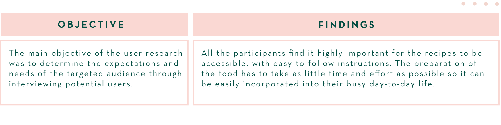
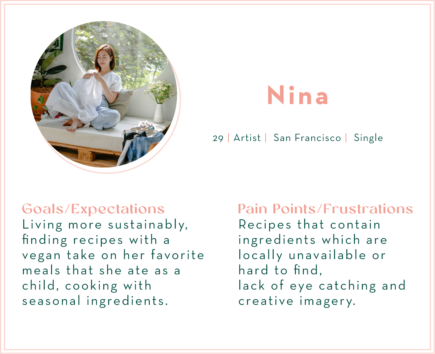
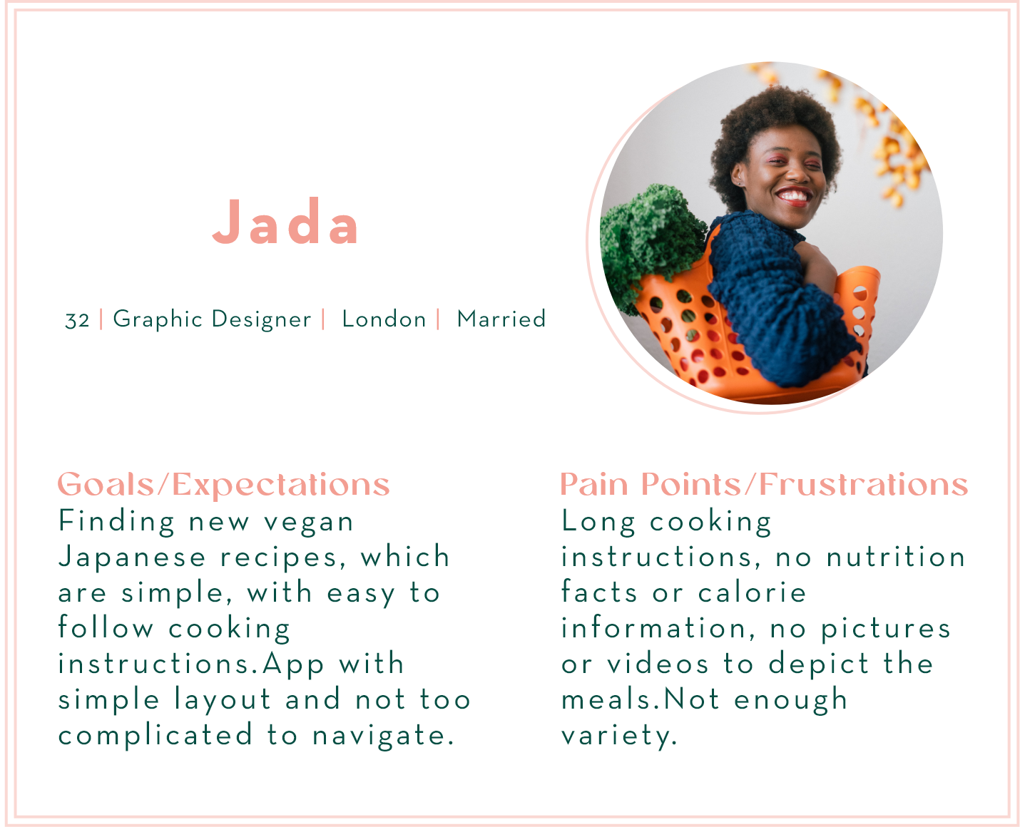
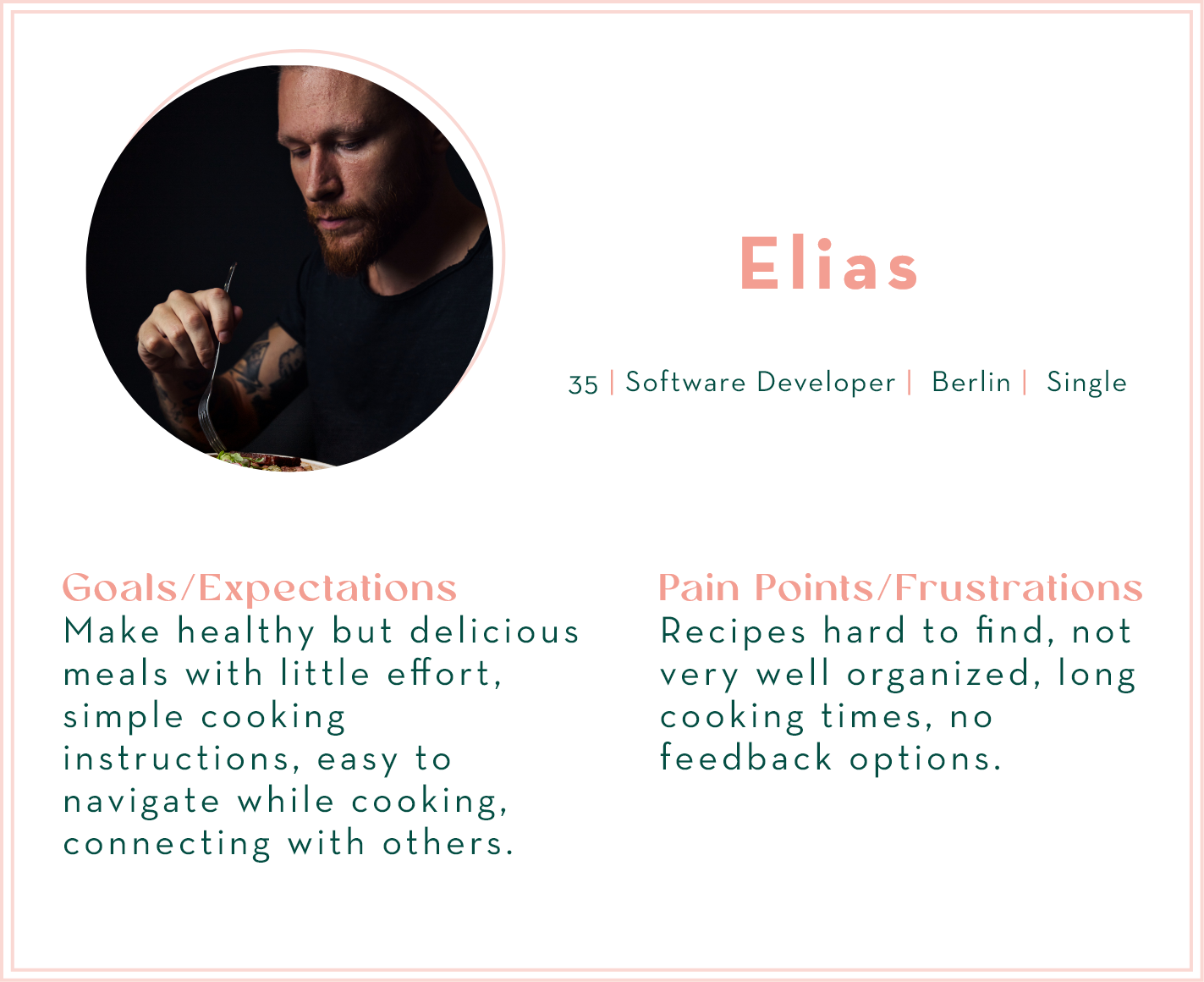
After the competitive analysis it was time for me to think of the features that I wanted to include in my recipe app. I decided to conduct user interviews to find out more about my potential users and their wants and needs .

USER Personas
The results of the user interviews helped me to understand my potential users better. Based on these findings I created user personas and determined their expectations of the application and also their frustrations. I then defined jobs to be done and the features that needed to be included, so the different tasks could be successfully completed.
User Flow
The user flow was created based on the Jobs to be done and illustrates the path the users take in order to compete a specific task.
RAPID PROTOTYPING
The next step was creating a rapid prototype of my app and then to test it on users. I made some sketches of the screens based on my user flows and defined the tasks I wanted the participants to complete during the testing phase.
USER Testing

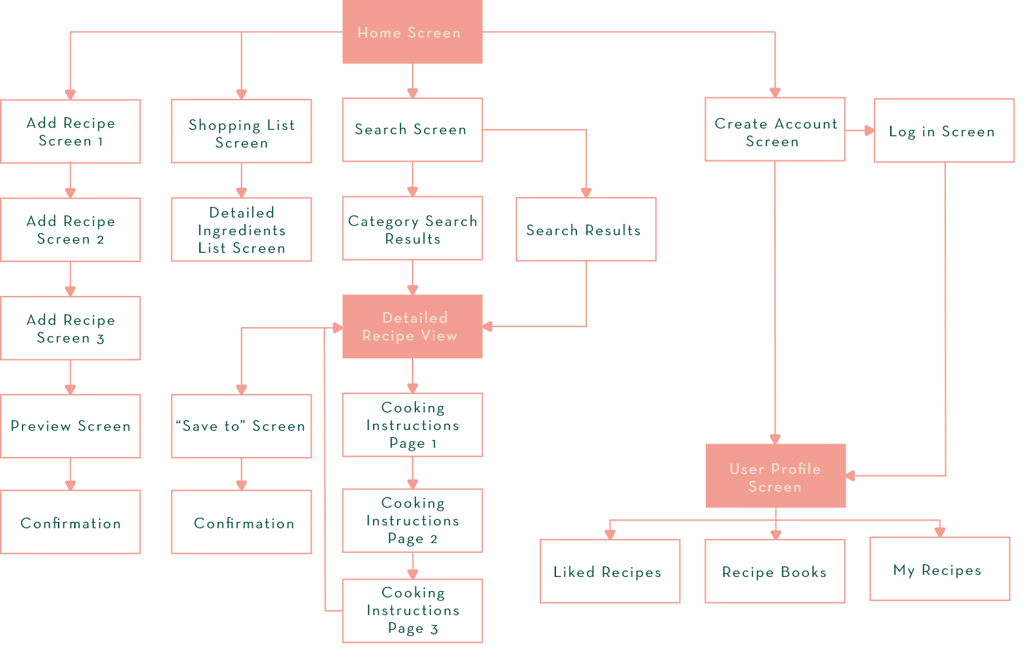
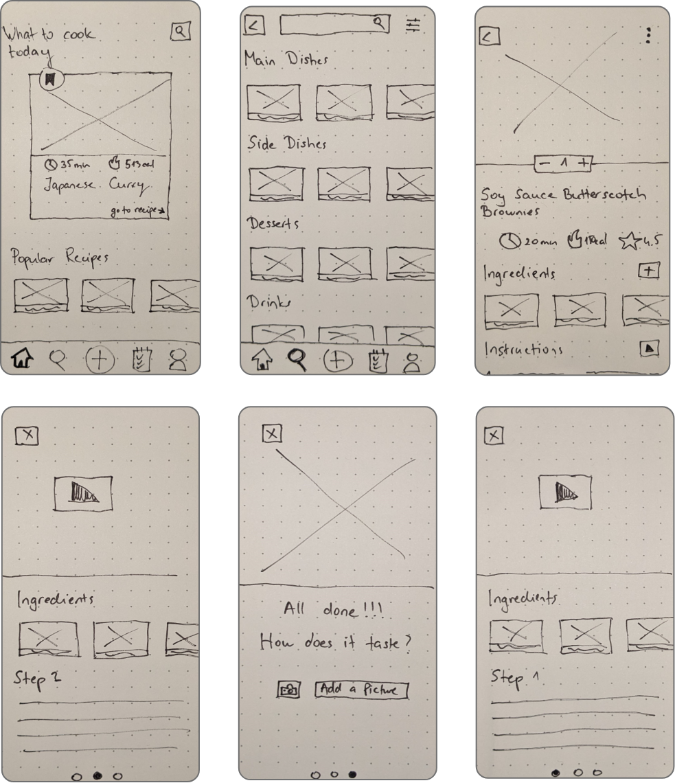
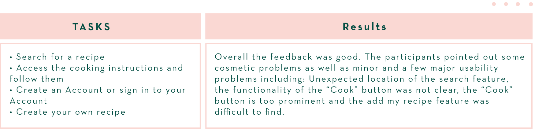
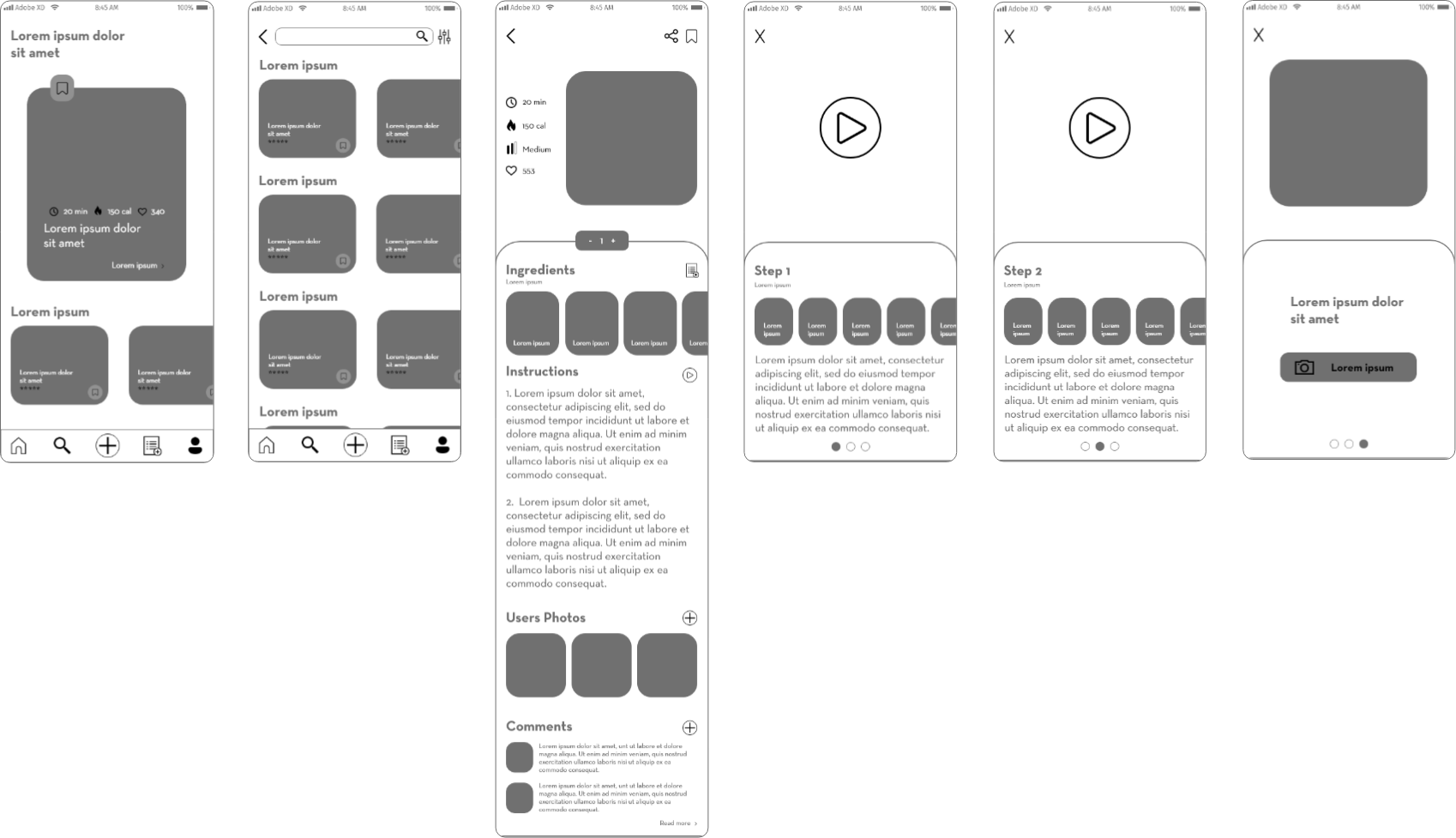
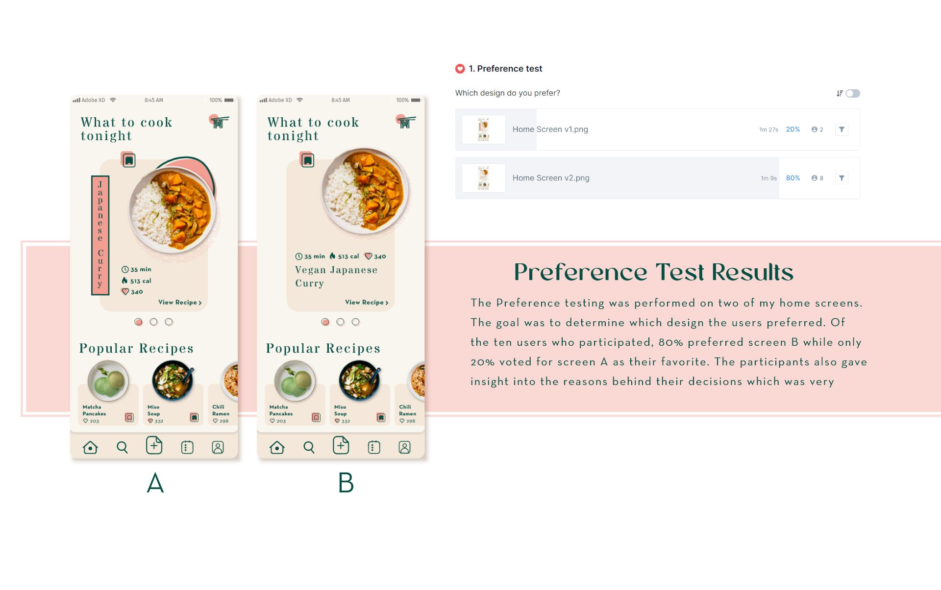
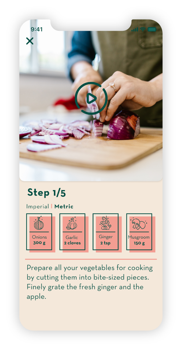
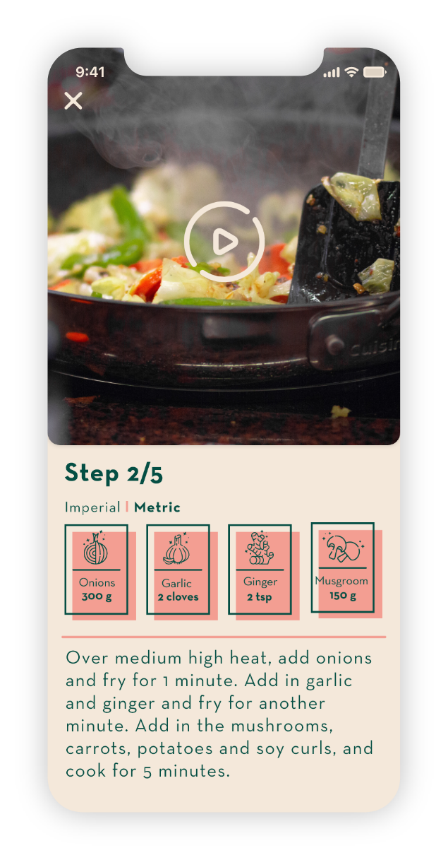
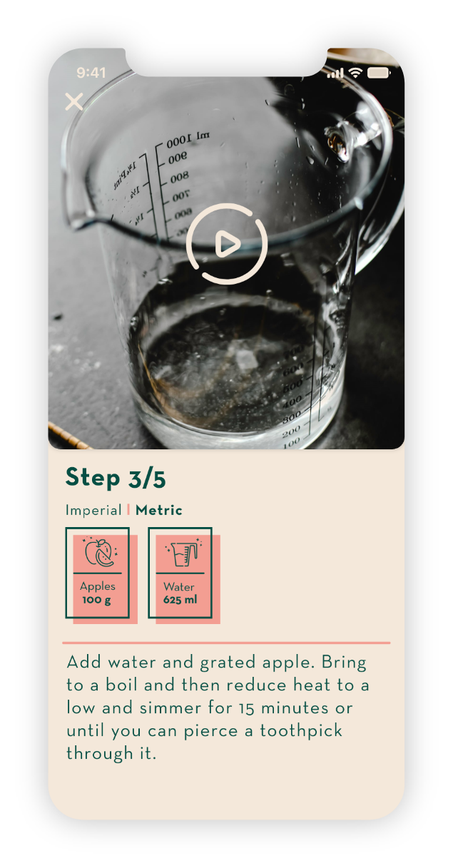
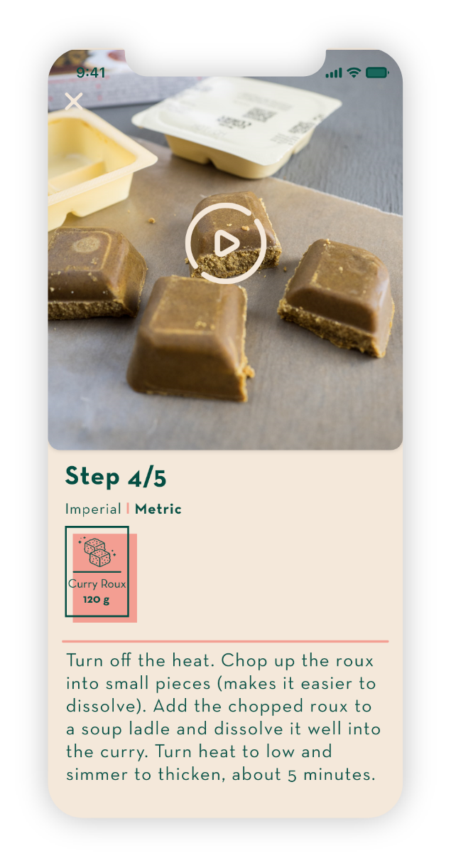
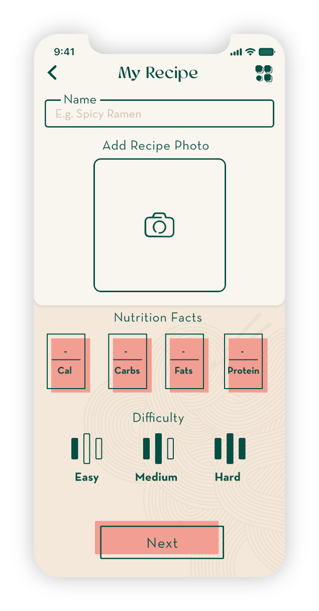
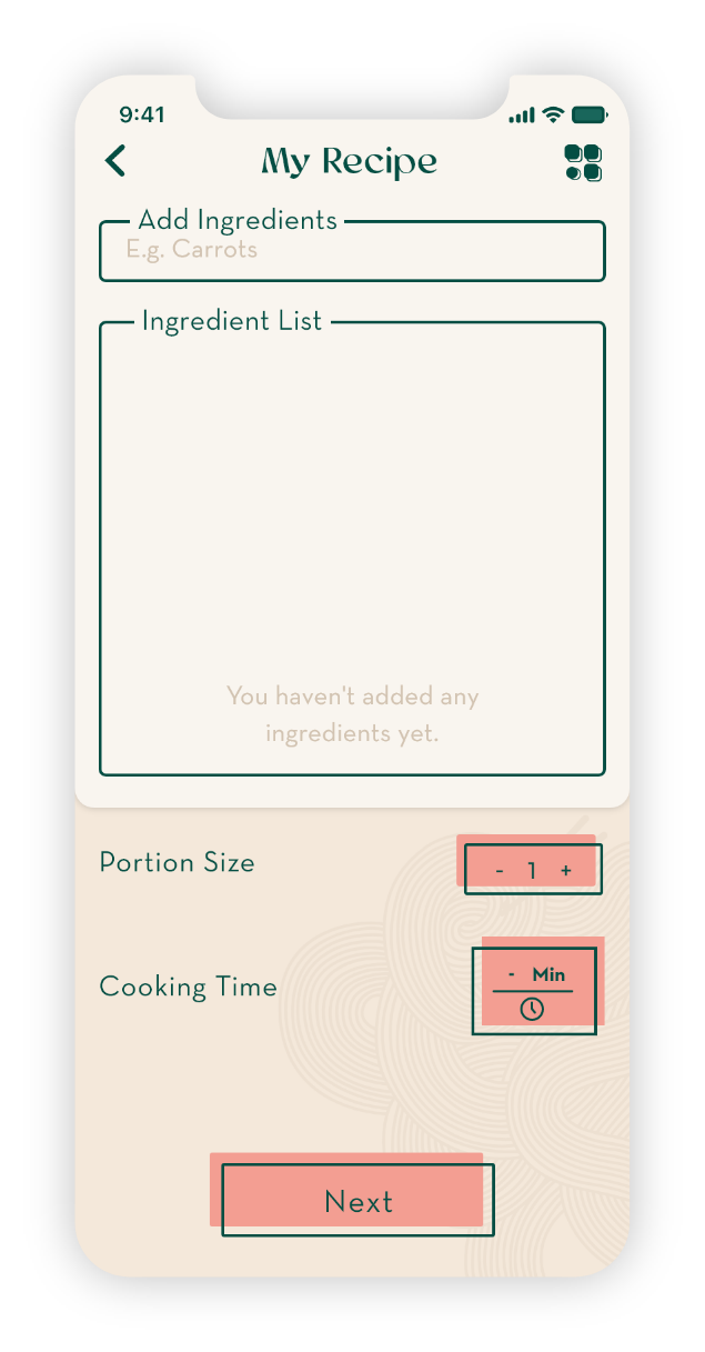
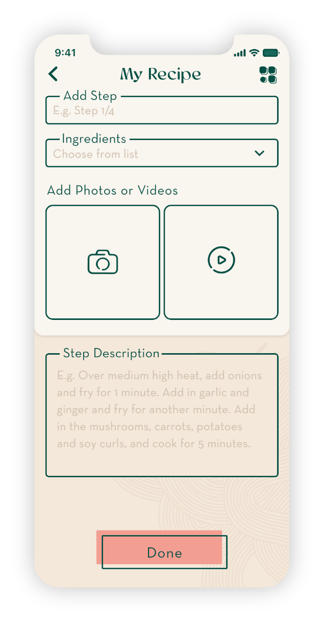
The sketches were made into a digital prototype and sent out for user testing. The main objective was to find out if there were any issues regarding the user flow.

MID-FIDELITY WIREFRAMES
Taking into consideration all the findings of the user testing I designed the mid-fidelity wireframes using placeholder UI elements, icons and typography.
Mood Board
The mood board is inspired by Japanese modern design with some elements of traditional Japanese aesthetics. The design is minimal with some geometric elements and traditional patterns. The color palette is quite neutral with one accent color. The green represents nature, which is very much celebrated in Japanese culture. It also ties in with the vegan aspect of the app very well.
STYLE GUIDE
Inspired by the mood board I've defined my style guide with the color palette, typography, icons, UI elements and imagery.

Color Palette

Typography

UI Elements

Icons

PREFERENCE TESTING
Before I added the visual components to all of my screens I designed only one screen and made an alternative version in order to do some preference testing on potential users before moving along with my design.
Final Design
Responsive Design
As this is a responsive web application, I've created designs for 4 different breaking points of the screens, this allows for the web app to be available for all devices.